Hi All,
Just wanted to share a beautiful and useful open source data visualization called hGraph https://www.hgraph.org/. I am exploring ways to adapt hgraph to my QS work regarding well-being as shown in the screenshot below. You will probably find the data visualization is useful for other types of QS experiments found on this forum. Try the live demo here https://www.hgraph.org/demo/, I would also be interested in hearing what you all think about this data visualization.
Regarding future evolutions of hGraph, I would be interested in the following:
Power BI plug-in for hGraph
easy to use utility that, given one or more datasets, the utility produces a PDF containing the resulting hGraph(s)
Hi Edward,
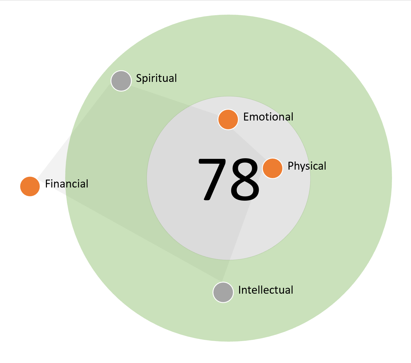
I assume you are referring the the general hGraph visualization and the overall score (i.e. hScore) at the center of the graph? Is there a single algorithm for hScore or it varies with each implementation?
The company behind the hGraph (goinvo) seems to be thinking along your lines, they have a github project called hScore and the idea seems to be a single algorithm (even if the project is absent of code at the moment but does show activity in last three months). As a side note, hGraph was mentioned on this forum five years ago, I believe it has evolved a bit since then, and I understood there is an iPhone hGraph app coming shortly. So something is moving in that project.
In my case, i am exploring a custom algorithm to compute the overall score for well-being in my household. The algorithm works by calculating metrics across five dimensions of well-being that include Spiritual, Physical, Emotional, Intellectual and Financial well-being. The final score at the center of the graph represents the output of this model. For example, the “Physical” metric computes a score by factoring in overall Health, Activity, Nutrition and Sleep. The “Emotional” metric computes a score by factoring in Mood, Sleep, Socializing, Trips/Travel and so on.
For example, let’s say we’re talking about sleep and we assume 8 hours is ideal. Where would we plot 7 hours? On the edge of the green, or out of bounds?
One small example but as I think about implementation I realize I would run into this issue across many different metrics. Seems quite subjective where the threshold between good and not good is.