This sounds like an awesome project, Azure. Could you provide us with a list of the devices you will be using to perform the data collection?
Gianluca
This sounds like an awesome project, Azure. Could you provide us with a list of the devices you will be using to perform the data collection?
Gianluca
I am also interested in the devices. Marc
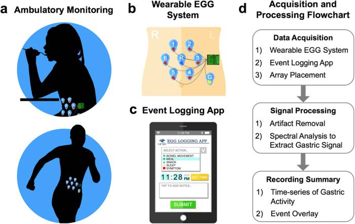
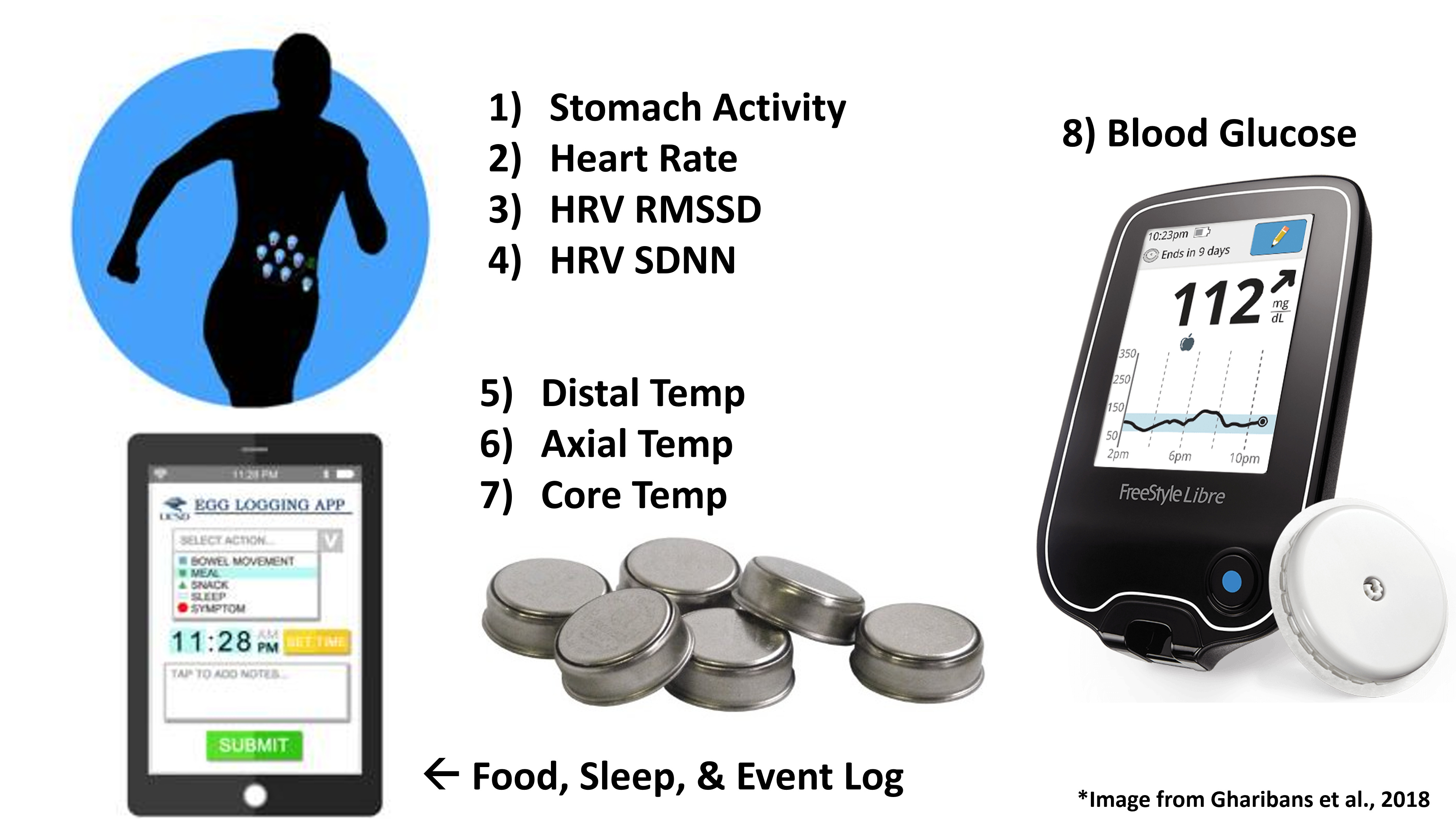
Devices:

Odds and Ends:
I always record my cycle details in Kindara and use Wondfo LH strips to try to figure out ~ when I ovulate. (As I’m starting this, I’m in late luteal phase)
I record when I get hungry, my subjective sleep quality, and any random details (e.g., I replaced an electrode) in a google form I made.
Ok, happy to provide more detail if it’s useful to anyone. Tomorrow I’ll try to upload a more orderly “methods” post with my approximate routine, how I use actually use the devices and planned analyses.
Thank you! This is going to be an awesome study with a wealth of data! I look forward to seeing the results
Thanks Gianluca!
Here is an update on how I use the devices in my daily routine, and how I plan to start data analysis once I finish recording:
Daily recording routine:
06:30-07:30: normal range of waking time. Remove/sync Oura and Wavelet and EEG electrodes (daytime data is too noisy to be useful, and it’s pretty uncomfortable to wear the two leads on my forehead). Read glucose data (has to be done every 8 hours at least).
07:00-08:00: Start 45-60 minutes of moderate intensity running or cycling. Running can’t be done with the gutrig on, so I’m trying to mix in days of riding a stationary bike. This will likely contain artifacts, but I’m attempting to minimize those (by remaining upright). Then remove gutrig, shower and replace. Sync data from the 24 hours before.
08:00-09:00: Small breakfast and or green tea. Takes about 20 minutes to eat/drink. Then to work/school (walk a couple miles, drive a couple miles)
11:00-12:00: Brunch/Lunch. First real meal of the day. Takes about 40-60 minutes to eat.
17:00-18:00 I usually get very hungry and go home (walk a couple miles, drive a couple miles).
18:00-19:00 Approximate dinner hours. Some type of dessert (dark chocolate or fruit) often follows
20:00 almost always have stopped eating/drinking by now.
21:30-22:30 approximate time I go to sleep. Apply forehead electrodes for sleeping. Put on Oura and Wavelet. Read glucose before bed.
Note on kinds of foods eaten/pattern of eating: I eat mostly Moroccan/California style food (I.e., tagine stews and salads), lots of fruit and scrambled eggs. Not much on grains, dairy, beans or sugary stuff. I usually have most of my food at an early lunch and evening dinner.
Chronotype: Obviously, I tend to be a morning person. My MCTQ (munich chronotype questionnaire) redundantly confirms I’m a lark…
Planned Analyses:
I mostly work in Matlab (2017a) and Excel 2016. I will try to do analyses that highlight the temporal relationships among the outputs. Due to the limits of my skillset, a lot of what I do so far relies on visual inspection of spectra generated from my outputs. I plan to use continuous and discrete wavelet transforms (base code and papers mostly by Dr. Tanya Leise), and wavelet coherence from the matlab signal processing toolbox. The first will estimate the strength of the daily (~24 hour) and ultradian (~1-4 hour) rhythms I expect to see in the data. The second will compare signals from the outputs pair-wise to assess a) the stability of any phase relationships between each pair [e.g., the signals always rise and fall together (in phase, 0 degrees out of phase), or rise and fall opposite one another (antiphase, pi out of phase)]. I am interested in making very simple network models from the interactions among these outputs as well. I’ll use non-parametric statistics to quantify the significance of any cool patterns I see (e.g., a significant change in the ultradian coherence of glucose and heart rate by sleep vs. wake state ). I plan to aggregate the data on day 11 (right after my CGM runs out).
Note on Freestyle Libre comparison: My two cgms are reliably ~ 10 mg/dL different from one another, sometimes up to 20 mg/dL different. The shapes of the signals at a glance look pretty similar though. They’re about an inch apart on my arm.
Note on Sleep Quality while wearing all this stuff: About 03:00 I’ve been waking up, since doing this set of observations, and I’m almost positive it’s because the gutrig is sort of irritating to wear (itchy?). I’ve been testing different electrodes for comfort (ConMed red dot, ConMed Softrace, ConMed ClearTrace2), and the Softrace electrodes are by far the winner (they’re designed for use on infants I think). They have to be held on by a headband or ace bandage or they will fall off after a few hours, however. Last night I managed to only wake up for a few minutes, so fingers crossed my data wont be confounded by poor sleep every night.
If anyone has suggestions on analyses or features to look for, let me know!
I’ll probably cluster shorter posts a few days at a time until I finish, in the spirit of keeping this as a project log.
Cheers,
Azure
Very cool project. As you know, I am also tracking my network physiology. I’ll be eager to see how this goes as a pilot, and to hear thoughts from the community.
OK Dr. Smarr I don’t think you can get away with a two line “good for you” since I’m in a position to know with certainty that you also have very well developed kit for this sort of extreme tracking. You should at least give us a list!
Fair point, Gary. Thank you. I’ll start a notebook of my own, so I’m being a more proactive community member.
However, I seem to recall that you also have ibuttons and I’m guessing access to activity, if not HR, etc. from a wrist band.
Perhaps since you also are pretty well positioned for “extreme tracking” you could join us?
Touché - and will do.
This looks really thorough, Azure! Adherence to a strict schedule is always a challenge (especially when life throws curveballs), but I wish you the best of luck!
Regarding the analysis: would you consider making some of the data available for others (who perhaps don’t have access to the same equipment) to analyse and build tools for? I know that it’s quite a personal thing to share, but I’m interested to know your thoughts. Building analysis tools in Python and R would be really helpful, as Matlab can be prohibitively expensive, which (anecdotally) reduces the growth of open-sourced artefacts.
Can’t wait to hear how this project unfolds for you!
Best,
Gianluca
On uploading my data/code:
Gian: Absolutely. Somewhere around August 8-10 I plan on uploading an excel file with all of the timeseries (including my annotations) here, and to OSF. I’d actually love it if someone(s) were interested in working with the data in Python. I would like to do so myself; it’s purely an issue of comfort zone/procrastination (and being able to see my variable space) that I cling to matlab rather than working in jupyter notebooks. That said, I will also upload my .m files in case they’re relevant for anyone :). In turn, if you or anyone happen to look at the data and see something interesting, please share it here!
Update On The Project:
~5.5 days to go!
Everything’s going well so far. It continues to be easier to sleep with the electrode arrays on while using the conmed softrace infant electrodes. The Freestyle libres are also 1) not sore anymore 2) in much better agreement as of (early yesterday I think?); they’re now usually <10 mg/dL different and 3) creeping upwards [I’m not sure if that’s a device trend, or if that’s me]. I’ve modified my routine a little, doing stationary bike rides instead of running a few mornings so I don’t have to remove the rig while exercising. Since I’d like to be able to look at daily rhythms in my gut activity, having a handful of days without a hole in the morning will hopefully let me fill in the ~2 hour chunk with an estimate from my biking time. We’ll see if my stomach looks consistent enough from day to day to do that.
Something I’ve noticed wrt glucose: 1) My morning glucose rise seems to be exacerbated by morning exercise, but certainly still is present without it! 2) I’ve been seeing very regular-looking ultradian ripples these last few nights when I’ve slept well – this was not the case when I was sleeping fitfully in the early am at the beginning of the project.
It also occurred to me that it would be much better to capture the timecourse of each meal than only to timestamp around the time I’ve started eating. So, I’m recording an event everytime I start eating, and also at the end of every meal as of yesterday morning.
Cheers,
Azure
The question of agreement between the Freestyle monitors is interesting; my outliers were during the first 48 hours of using a new sensor.
Almost done?
Hope you managed to finish successfully. I’m interested to hear your feedback!
Hi guys!
I’m currently assembling the data.
The bad news is that I cut the data collection short on day 9 (for the gutrig); at that point my stomach and forehead were getting pretty irritated from the electrodes, and one of my CGMs was starting to fall off. (Can you tell I was feeling done?)
The good news is that there are 8 and change full days of data across all modalities, which should be sufficient for the circadian rhythm analyses I have in mind so far. The only output with ‘holes’ is the gutrig, which has about 30 minutes per day missing on I think half the days, and more like 1-2 hours missing per day on the others (in which I went running instead of bike riding). I’m planning on filling in these holes with either 1) an average of the non-missing data for that time of day from other days, or 2) a plain old spline interpolation.
I’ll upload the data here within the next couple of days, and then will also share a public google drive folder with code.
Thanks for following along,
Azure
P.S. I DO plan to repeat this and will try to break my record for longest number of days of continuous recording . That should happen by the end of october, barring anything fun we see in the data that inspires me to repeat sooner!
Alright - In the spirit of sharing - data and code are below! Why the delay… I started grad school and the last week disappeared in a flurry
Here I am attaching 1) My Data in excel, 2) My Matlab Script in progress 3) My matlab variable space of cleaned and formatted data for each output, and frequency decompositions thereof (I’ve spent a lot of hours of my life figuring out how to appropriately clean these different data types, and I frequently learn more… so if you have matlab or octave this should be a big help).
Google Drive Link to my Data: https://drive.google.com/open?id=18qDwXbsnerlXTA03F-Zdjrysk4kSaTCh
This contains all of the outputs (including SDNN HRV and RMSSD HRV thank you to Armen), excluding EEG (still processing). My annotations and MyFitnessPal data have their own tabs, but all other timeseries are in the same sheet. ‘Dist’, ‘Axial’ and ‘Core’ all refer to body temperature. The accelerometer data is raw (I have not bothered to find a very good way to convert it into distance - if anyone has quick matlab/jupyter suggestions let me know!). I highly recommend that if anyone wants to manipulate the data they use the variable space I generated in which all data is aligned in time and cleaned, and in which I’ve already generated frequency breakdowns for every minute of the data. Those are pretty big files, but if someone is a non-matlab user and would like me to write that to excel, happy to!
Google Drive Link to my Matlab Code: https://drive.google.com/open?id=1fMMQa5z2lqK1ug3rjcMliagwSf_mFt-V
(This is in progress and not extensively annotated… if anyone looks through it and wants to use/ask - I’ll be updating it continually to this link; and I’m happy to answer questions!)__
Google Drive Link to my variable space: https://drive.google.com/open?id=15Fb5J0fVh0v6fM4T35H--mhasccqii1Z
Alright, I will save a separate entry (hopefully before next wednesday) for preliminary figures I’ve made exploring!
Cheers,
Azure
Great breakout session this weekend! Are you familiar with Mira? It’s a LH fertility monitor+AI. I just found out about them and am intrigued: https://www.miracare.com/
Thank you Shara - I hadn’t seen them but now I’ve sent them a message. Thanks again for coming to the breakout Followup message is out, excited to start the project!
At long last - I’m posting some results of my baseline network physiology project. This is basically the story of how my data became more erratic/unstable leading up to me getting sick - without me being aware that this was happening.
I gave a talk about it at QS18 (Link to follow) . I’m adding the figures from that talk (and some extra ones) with captions.
My intention for the project had been to capture as many outputs as I could, over several days, in a healthy state. HOWEVER, the day I took my devices off I got sick. I had no idea at the time that I was getting sick (though I knew it was harder to sleep well with all the electrodes on, and thus was feeling pretty done with the process after 8 days!).
Because my background colors what I see in my data…
My background is in biological rhythms (circadian, ultradian, ovulatory). Circadian rhythms are endogenous (created by the body), 24 hour oscillations that occur across almost all bodily outputs. Ultradian rhythms are faster, they occur several times within each day (e.g., sleep cycles every 90 min during sleep, getting hungry a few times per day). It’s not known which ultradian rhythms are endogenous, and they don’t seem to be guided by a main brain region. Ovulatory rhythms obviously take longer (30-40 days in me), but they also play a role. All these rhythms happen at the same time, and we know that at least the circadian and ovulatory ones can become uncoordinated in sickness states…
When I looked at the data, I noticed that the first ~ 4 days of data looked “stable” (I.e., the daily and within-a-day fluctuations looked basically the same day to day), and the latter four days looked increasingly ‘uncoordinated’. Below explains what I mean by uncoordinated :). Another thing that sunk in was the degree to which these outputs’ daily rhythms look like square waves in me rather than sinusoidal curves. A lot of analyses (cosinor analysis obviously), but also the wavelet transformations I use, try to model the underlying wave as a sinusoid. Probably we could do better with a square wave or mexican hat for these outputs!
These are the devices I ended up showing data for: electrogastrogram (EGG), BPM, HRV RMSSD (Root mean square of successive RR interval differences), HRV SDNN (Standard deviation of NN intervals), wrist, abdominal, and core temperature, and interstitial glucose. I’m not going into logging of specific events here.
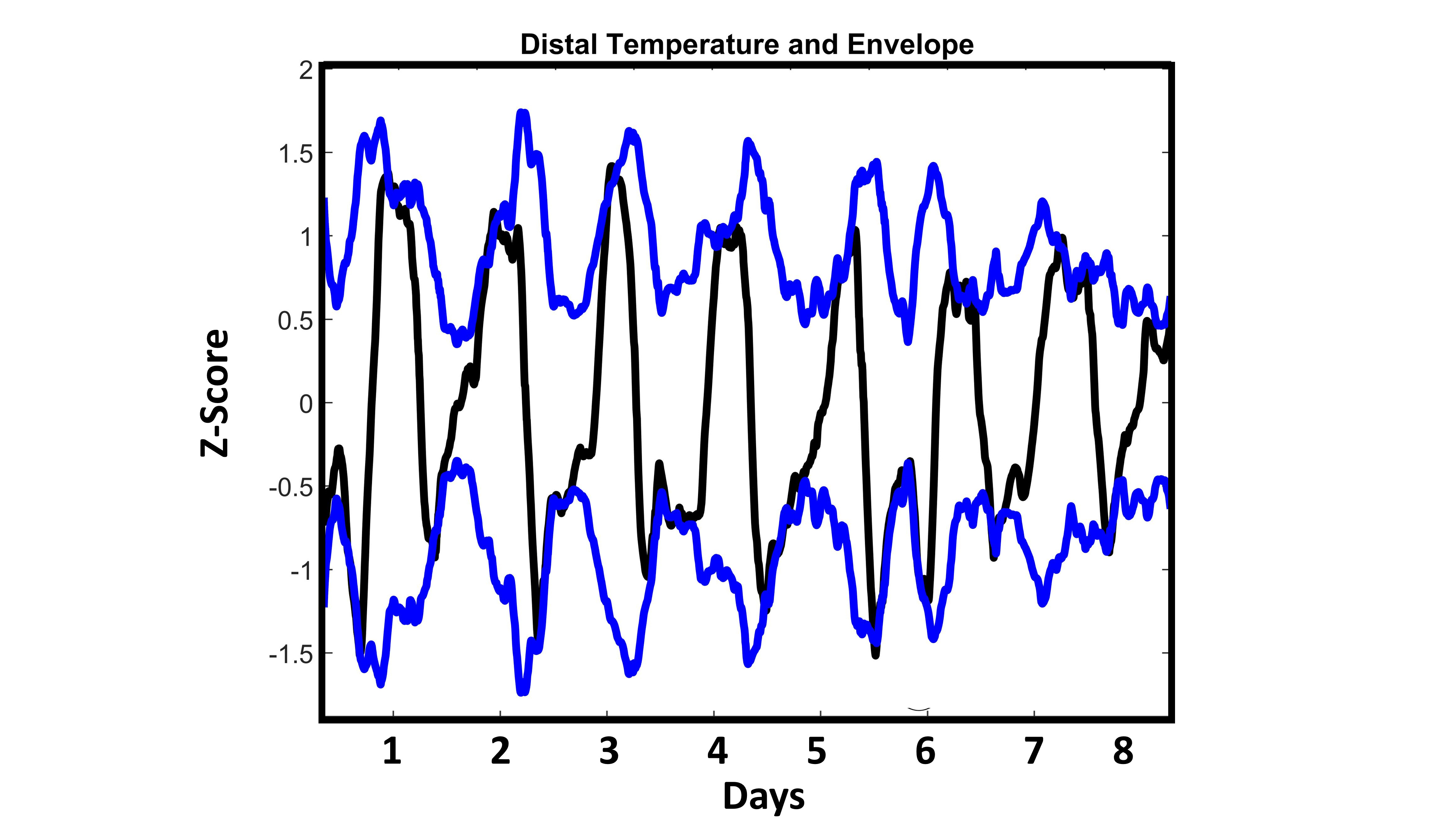
Fig 1:
My distal (wrist) temperature and its “envelope” (consider this a measurement of range). This is smoothed data to emphasize th daily rhythm: each day my distal temp rises and falls in a square-wave-like pattern. The first four days, to my eye, looked similar to each other. The last four days looked like they had a progressively shrinking range. See below
I decided to plot different outputs, and see if anything else looked to change around the 4 day mark. I noticed differences in several different signal parameters (including range, phase and periodicity) See below for more detail.
Fig 2.
This shows 4 pairings of data (out of 28 potential combinations). I chose these to illustrate a few instances of how individual outputs - and their relationship to one another - changed from before, to after the 4 day mark.
Top Left: Glucose and Distal: We saw the distal range compressing in Fig 1. But this shows that, additionally, my glucose jumps up, and loses a lot of the clean daily rhythmicity after day 4. Also, I’ve seen in many individuals that glucose and wrist temperature are antiphase while one is healthy, and that this phase relationship falls apart following jetlag. It looks like that antiphase relationship also disappears in me leading up to sickness!
Top Right: Glucose and Stomach Activity. For the first ~ 4 days, my glucose and stomach are roughly in phase, with glucose preceding stomach by a little. Especially on days 5-7, my stomach daily rhythm is blunted and loses that phase relationship to glucose.
Bottom Left: Core and Distal Temp. In this one the antiphase-relationship is maintained, but my core temperature range starts to drop toward the end of the record. This is the pattern I expect to see for Core in the late luteal phase. Not sure if this is related to sickness.
Bottom Right: HRV and Distal Temp. These two are very well in phase, both across days and within single days. But on days 4-8, my HRV shifts markedly higher, and higher still if one looks just at days 6-8.
How to synthesize this? Keep in mind that with 8 outputs I have 28 possible interactions. Looking at them all and trying to come up with a more eloquent gestalt than “things look mishmibbed in the second half” was hard.
I decided to do wavelet coherence, which is a measure of time-frequency coherence. I did this to try to get one number for each pairing of variables that would tell me how coordinated the within-a-day and daily rhythms were at each moment of time. My idea was that then I could look at the first and second half of the logs, and have a consistent metric of how ‘stable’ the interactions between pairs of my biological rhythms would be.
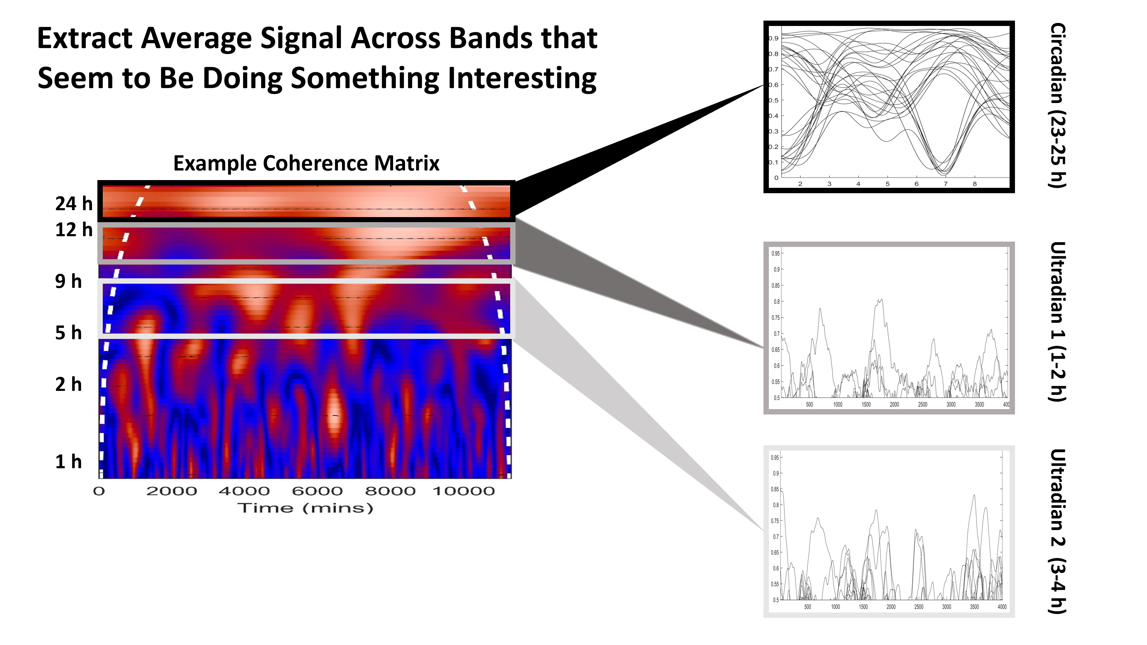
Here’s an example of what wavelet coherence looks like, and what I did with it.
Fig 3.
This is a quick hashed out slide. The X axis is time in minutes,
the Y axis is periodicity in hours. The white dotted line is like a confidence interval - I discard values outside it. For each pair of outputs (28 total), the wavelet coherence is a numerical representation of the degree of coordination among those outputs (red colors are larger numbers, blue colors are smaller numbers). 1 is the highest number (100% coherence). Each pixel in that heat map represents one of those numbers. I extracted 3 periodicity bands : 23-25 hours (circadian), 1-2 hours (ultradian 1) and 3-4 hours (ultradian 2). More on why I selected those ultradian bands in a minute.
Fig. 4
I averaged the coherence metric across these bands to generate these lines. Each one represents a pair of outputs. I could see that a handful of outputs tanked in circadian coordination around day 5-6, and that the changes in ultradian coherence seem… not obvious.
I decided I needed a clearer way to visualize all these outputs’ coordination at once, so I decided to make a graph. In the following figures, each dot represents an output’s rhythm (they are labelled), and each line represents the strength of its coherence to the adjacent output’s rhythm. Red is weak, blue is strong. Thin is weak, wide is strong.
Fig 5.
Here I noticed that my stomach activity was that group of lines that tanked! It seems to really become uncoordinated at the circadian timescale. Some outputs become more strongly connected (Core Temp and HRV RMSSD).
Next, I wanted to make the same plot for the ultradian rhythms. After messing around, I remembered that ultradian rhythms get faster during sleep, and slow down during the day! It wasn’t until I separated sleep and wake, and faster and slower coherence bands, that I figured out what was going on.
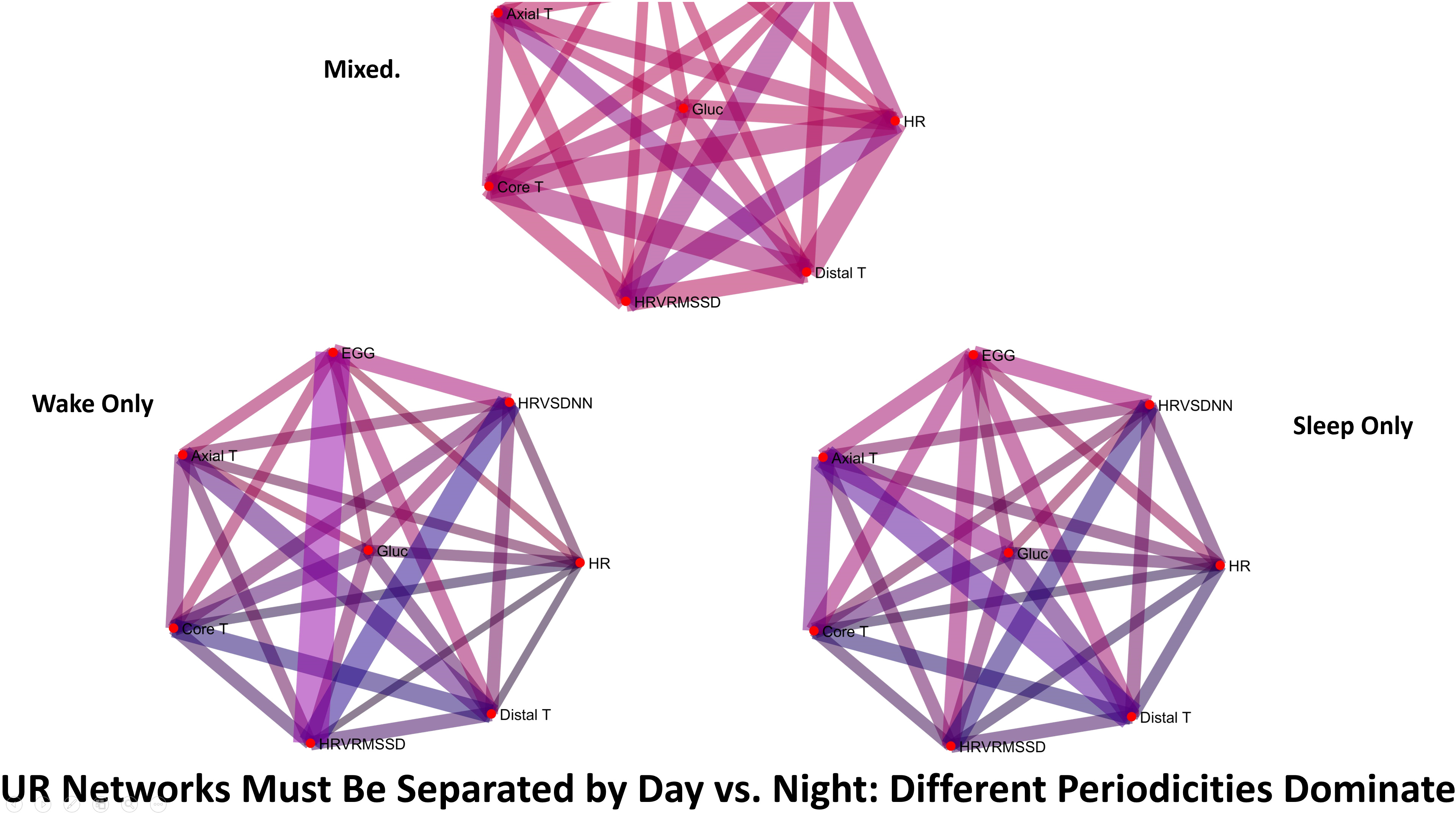
Fig 6.
The top graph (mixed) is the unseparated data. It looks a little like those linear plots - all the lines are pretty pink/red (meaning there is little coordinated activity. The Wake Only graph and the sleep only graphs, however, are much darker overall. Some edges are dark blue, others a darker purple. This seemed more reasonable, so next I split the data into days and nights that were healthy, versus sick.
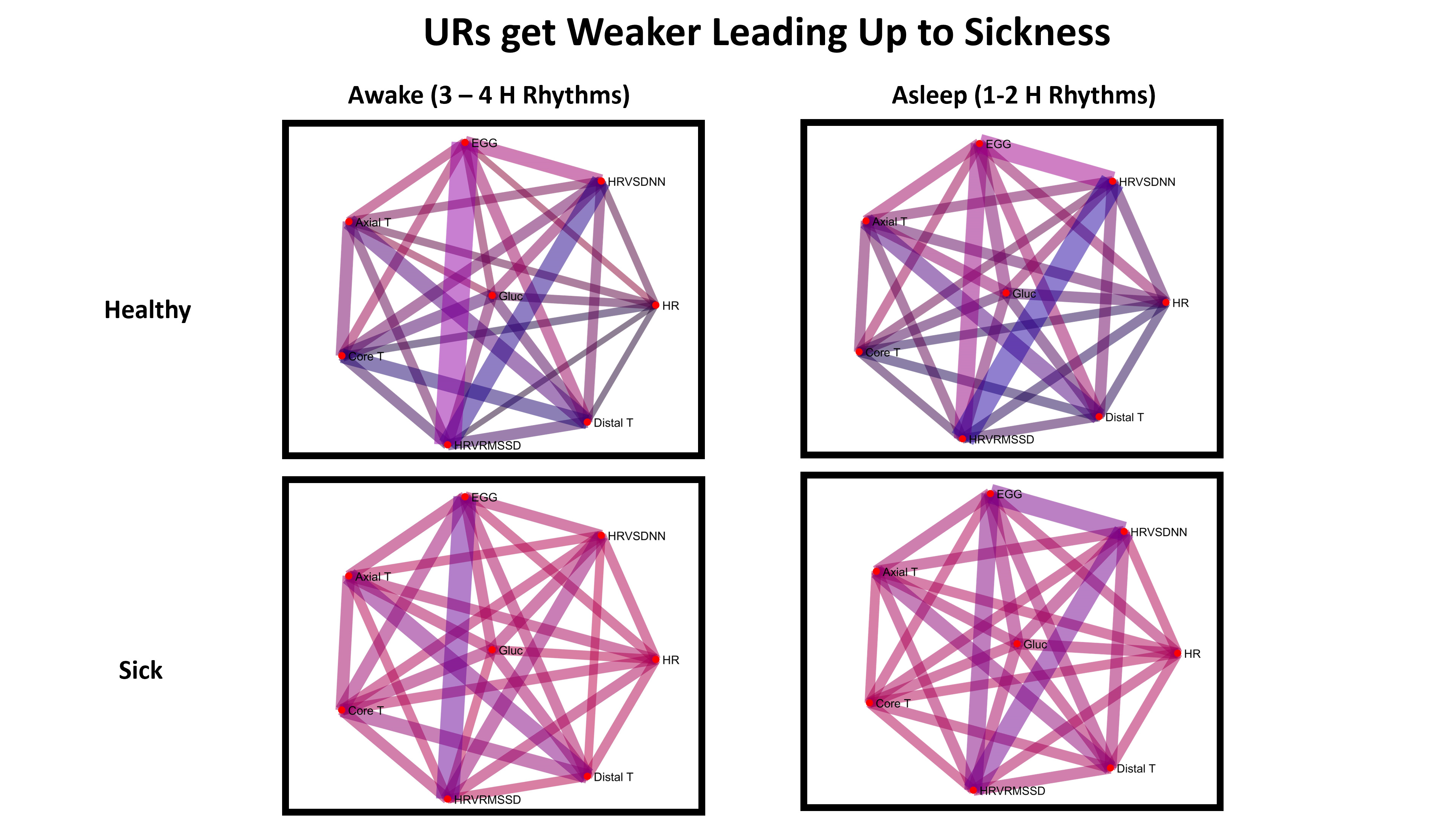
Fig. 7 (Last one!)
This is my favorite figure On the top row are my healthy ultradian rhythms, on the bottom are the ones that preceded sickness. Overall the rhythmic coordination preceding sickness is much weaker!! I thought this was pretty neat that the whole network loses specifically ultradian coordination !
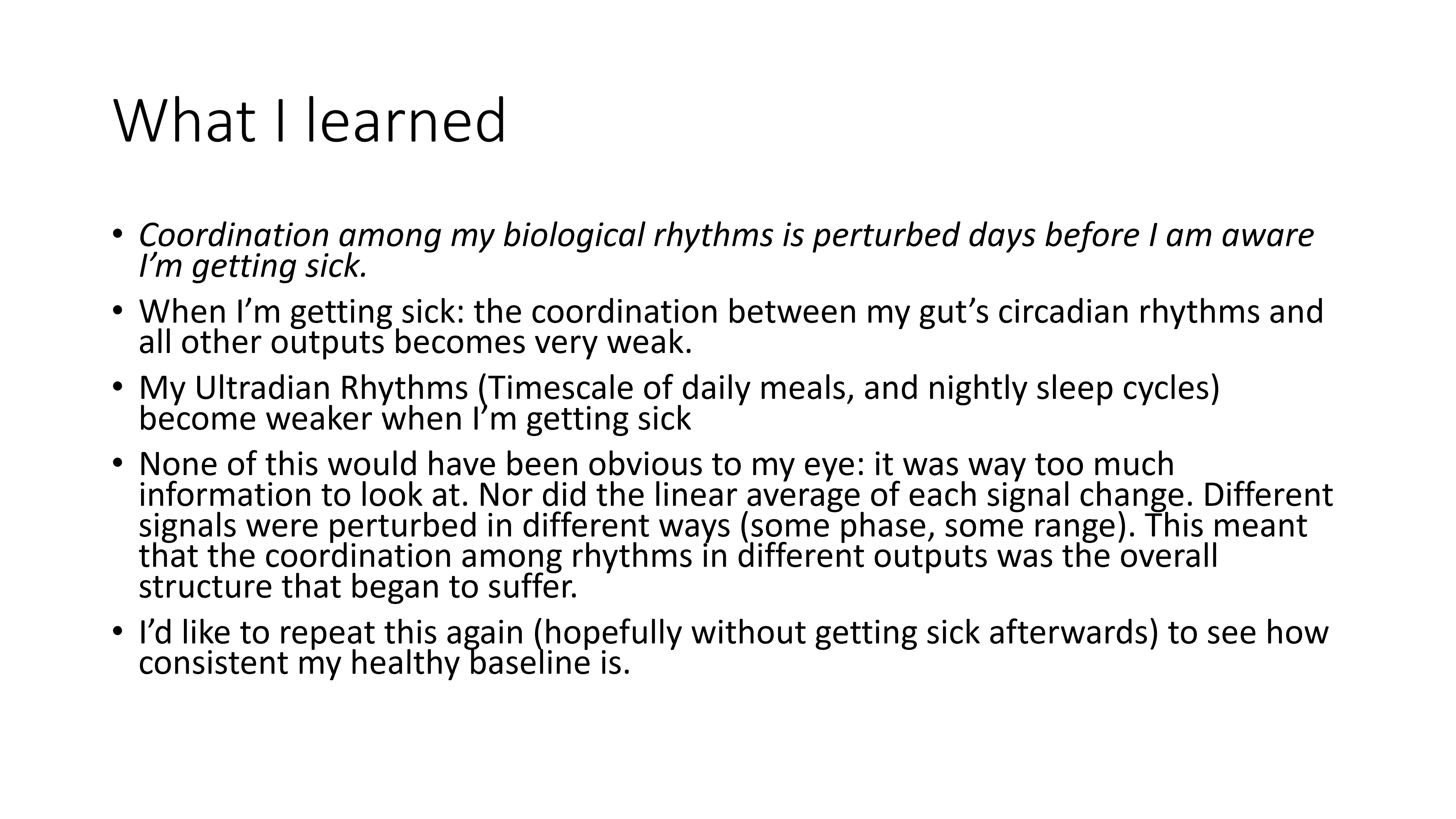
Last, here’s a brief summary of what I learned. I’d like to do more with the data and visualization (e.g., make the node diameter proportional to the robustness of each individual rhythm, or do dynamic time warping as a measure of similarity between each day and the next…)
So thar she blow, if you made it to the bottom of this post let me know what you think! Also if this is confusing, happy to answer questions.
Cheers,
Azure
This is awesome! It is going to take me a while to digest all of this. I’d love to see if there is anything I can leverage from this for my own experiments. Thank you so much for sharing this.
Of course! Let me know if you have any questions.
~Azure