Now I’ve been trying to design wireframes/mockup for the Dashboard I envision!
You can watch me walking through my prototype in this video!
Otherwise, you can try the prototype here!
Otherwise you can see some screenshots here:
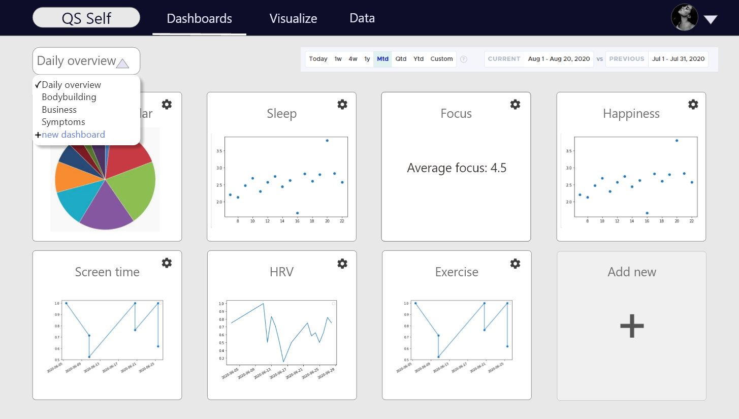
Dashboards:
- Create MANY dasboards and customize each box:
- Graphs
- Pie charts
- Average value
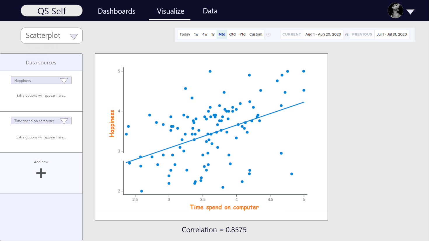
Visualize:
- Visualize two or more variables as:
- Scatterplot
- Time series
- Heatmap
- Bar chart
- I haven’t decided how you should be able to customize the graph yet…
Data import:
- Import data:
- Integrations (Oura, RescueTime, Google Fit, fitbit, Withings, Google Calendar, Cronometer)
- Manual upload of .CSV
- Maybe also public API?

The reason I don’t use the existing solutions are:
- I track with the Android app “Track & Graph” and NOBODY supports it…
- I want to see percentage of time in each of my Calendars as a pie chart.
- Since I track so many variables I want to create multiple Dashboards.
- I want to quickly put any two variables on a Graph/Scatterplot to explore my data
- I’m looking to automate the import of data somehow
What do you think of this solution? Would you pay subscription for it if it contains the trackers that you use?