What are your favorite dashboards to help you monitor your activity and why?
I like the simple ones. I can analyze the data by myself, and I know how to do correlation or regression, so I don’t need fancy dashboards to diverse my attention.
To be honest, if I need precise analysis, I don’t need a dashboard. What I need is the raw data.
But if I just want to have a general reflection, I just need the dashboard to show the trends, and perhaps some comparisons with my pre-set goals.
1 Like
I built a real time dashboard with a dedicated raspberry pi/tv monitor that tracks several metrics, the ones that I keep prominent are my Steps, Focus time and Unproductivity. I found it to be really helpful in giving me feedback on how I’m doing throughout the day and so I’m able to readjust how I structure my day based on where my current personal metrics are at.

I built a smart mirror to provide a dashboard to allow users to see their data every day effortlessly (Even on those days that they don’t want to see it  ) It’s a simple solution for our users who want to see 7 day trends, or how they are tracking to goals, or in the case of weight, blood glucose, blood pressure, we show the last 7 measurements, so that they can see the trend.
There is something to be said for forcing the dashboard to be seen by a user every day, from a behaviour standpoint, as most people simply ignore looking at their data on days they know the are not doing well.
More details on the smart health mirror dashboard can be found at https://www.mangomirror.com
This is the type of dashboard that is displayed:

3 Likes
Hey, it’s Jane, co-founder at Welltory - we have launched the most powerful quantified self dashboard so far.
IFTTT, Samsung Health, Apple Health, Google Fit, Rescue Time, weather, Githab, Youtube liked, Fitbit, etc, you can plug in everythin and we will not just enrich your data and provide with daily-weeky and annial view, we will calculate correlations between lifestyle factors automatically.
More to read about it -
1 Like
Can your app receive CSV files? Does it export ? What is the resolution / granularity of your timestamps.
What do you do?
I’m biased but for overall “activity dashboards” I like the ones I built for myself…
I use this one to keep up on overall shifts in my daily/weekly/monthly activity metrics…
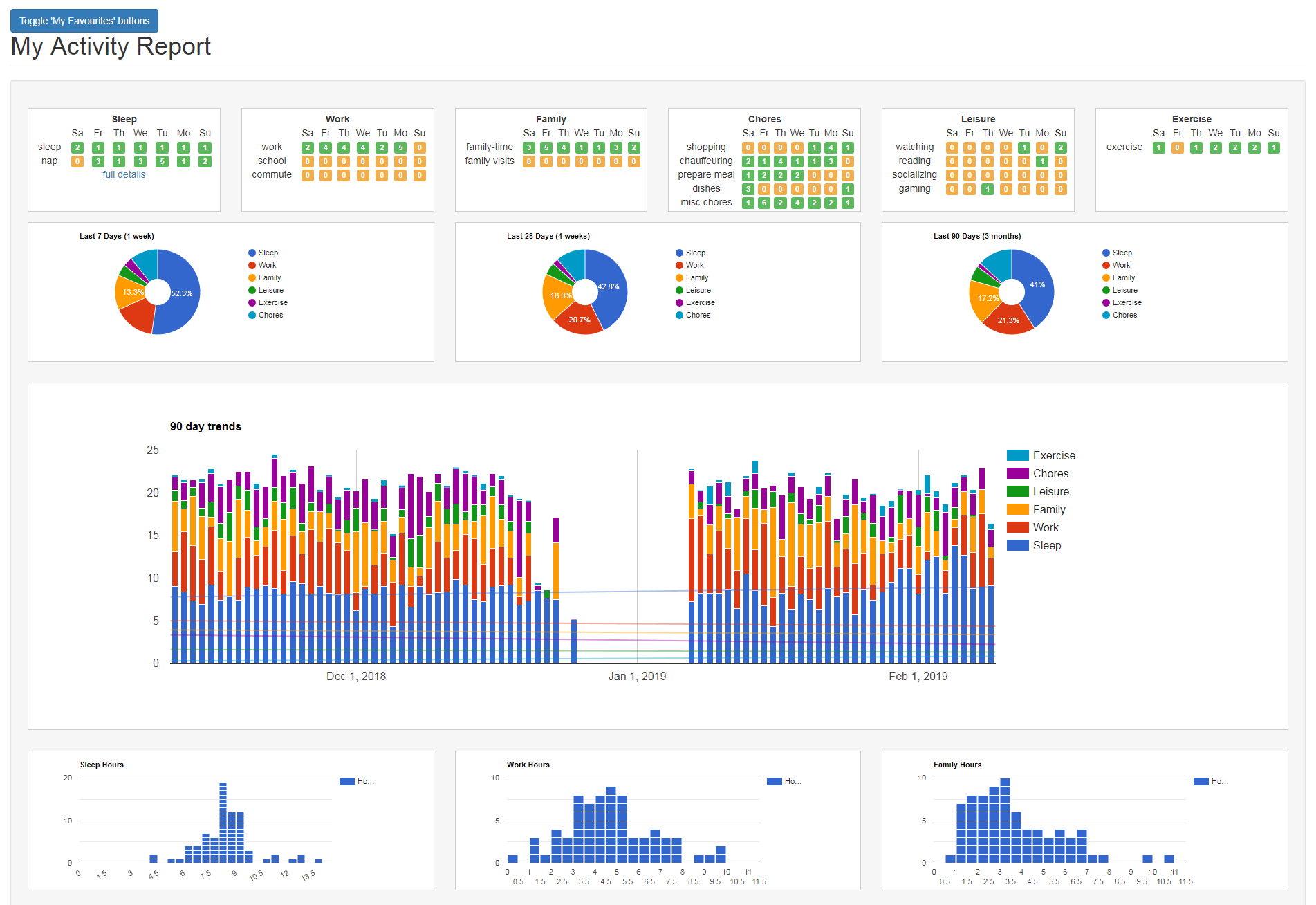
I use this one for more short term day-to-day comparisons…

Though I’ve taken a “sabatical” from full lifelogging for about 2 months now. Starting up again today (Oct.1) and curious to see how much change has happened without the 24/7 logging.
1 Like
I really like event chart. What library did you use to make it?
Can your app receive CSV files? Does it export ? What is the resolution / granularity of your timestamps.
It’s done with a Google Timeline Chart. https://developers.google.com/chart/interactive/docs/gallery/timeline
I generally leave the Event Chart open on one screen and watch it fill in automagically as I dictate my events to Google Home.
Timestamps are down to the minute with the user interface but it’s possible to use seconds as well, though they don’t show up in the user interface. Reason being is EventLoggers is meant mostly for daily events and not micro data from IoT devices, for example.
Yes, eventloggers.com has fairly flexible csv export - you can export all events, or all instances of a specific type of event, or say, all events that are rated Very Good, etc.
As for bulk upload, I have a rough interface but it isn’t documented well and you need to know the id of each type of event. If you want to send me a sample csv, I’d be happy to see if I can get it working nicely.
1 Like