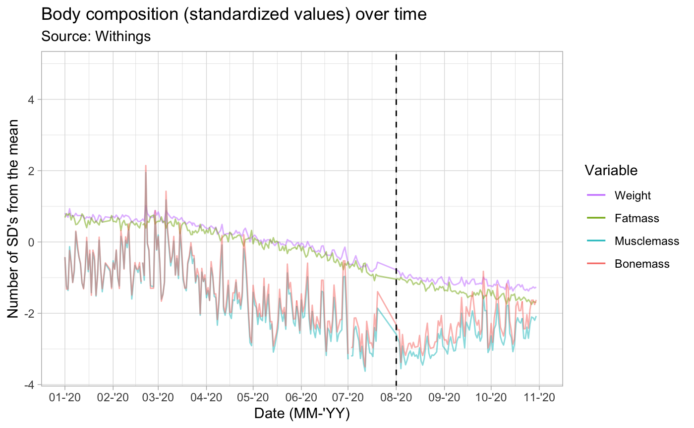
I just published a blogpost where I am sharing an interesting data visualization. After a period of weight loss, I switched from cycling to running (vertical line in the chart below) due to mechanical problems with my race bike. Afterwards, my fatmass loss continued at a similar pace (yellow-ish line), but my overal weight loss (purple line) stagnated, as my muscle mass (blue line) and bone mass (red line) started increasing as a consequence of picking up running.
I found it interesting that apparently running has such a different impact on my body composition than cycling does. Intuitively, this makes a lot of sense, but I’ve never seen it visualized like this, which was a bit of an eye-opener to me, particularly because it is based on my own data. The full blogpost with a more detailed description is available here: https://hermandevries.nl/2020/10/30/different-impact-of-cycling-and-running-on-body-composition-during-weight-loss/
If anyone else has similar experiences, I would love to learn about them!
PS: I added a download link for the R notebook that I used at the bottom of my blogpost, in case anyone wants to replicate this chart with his/her own Withings data.
