@Steven_Jonas did you see this?
I’m thinking about how to use our new QS Show&Tell online format to also create opportunities like the breakout sessions in the QS Conference. This would be a perfect topic for a breakout session.
We’ve been trying to figure out how to map data flows for a long time. But @rain8dome9’s approach is more modern and it would be interesting to explore/add to as a group.
(See pages 45-56 of this report for one attempt—the names of the tools will bring back memories). QSPublicHealth2014_Report.pdf (2.3 MB)
1 Like
As it is my approach can not be as detailed as your graphs. It would be far too cluttered. Runkeeper would not be distinguished by OS. 3rdparty HR monitors would all be connected by individual lines (or to a ANT+ Heart node) with the steps as one continuous string label. Getting and using that Wahoo attachment means those lines will be red for difficulty. Same way info and exact quality of data can be conveyed with more text and thickness of line. All file uploads, except Polar, would be one single arrow from unencrypted file node (“csv file” now). Health Graph API would be clutter of lines except APIs available to end user which is a node.
Often the useful information is in the “clutter”… For example, it’s easy to discover that device x can be used to capture heart rate and that this data can be imported into service y. But what may be less obvious are limitations like “device x is only suitable for capturing heart rate at rest”, or “you can only export heart rate at hourly resolution”.
The color and thickness of the arrow do these things. Vaguely. Its not in th pic but I have added that functionality. Really should have brought up this topic with next update.

Lots more work before its ready but there is a screenshot in passing. I need praise and feedback to keep focusing on the project.
2 Likes
@rain8dome9 I’m away until mid-next week but look forward to exploring. For feedback from a not-especially-technically-skilled user like myself, it might be good to be able to observe the graph in use, maybe in a screen capture. What is the advantage of using the graph rather than the tabular data? Can this be shown/demonstrated?
In tabular data it is completely impossible to visualize a connection between items of more than one step or the neighborhood of an item. The graph also sends more info faster via size and color of node and arrow. Examples; Find inimal number of apps needed to measure all these things I want to measure. Find other things that could be measured to get same idea. Find all devices that measure heart rate and offload directly to CSV. User could use queries but that is not friendly and user could miss other options because of rigidity.
There is a screen capture in the post preceding yours.
Yes, that makes sense. I meant to write “screen cast.” I saw the image, but what I’m wondering is what do I need to do to run/install the graph and explore it? This may be more obvious to others but I’m not certain.
Download the zipped repository and find index.html. It will open into browser and show the graph. Its not this huge on just the colorful one of my stack right now. In a month a cleaned version o f the big graph will be available.
I’d love to see what devices and services tend to be used together in self-tracking projects, similar to the Correlated Technologies chart in the latest Stack Overflow Developer Survey.

Would have to manually extract that data from show and tell talks and project logs…
We have some work to identify “tools used” in the show&tell archive and can provide that in tabular format if wanted. The diversity of tools is very great, as it turns out.
R is a node connected to pandas and hadoop. To get that info would require surveying lots of people and no one except maybe biohackstack has done this (afaik). In future (1 month to 10) I will add the feature to let users fill out a speadsheet to viz only their own stack but that will not be uploaded anywhere.
Yes please.
QS Archive Tools List.csv (12.7 KB)
There is a lot of archiving/data quality work that could be done to make this more useful, but it hasn’t been done and there’s little prospect of having time or money available to do it any time soon, but still glad to provide the raw expert if useful. There is also a link between tools and projects, but this isn’t very certain.
1 Like
Good job! Thank you. Nice work!
The data base is not completely cleaned but even now its way too big. My out of date system can not even show the whole thing without crashing. Way too many links. And worst of all any kind of information that the links provided is covered by other links except at the periphery. In order to make the following snapshots I had to filter nodes to only the ones that are connected to 6 other nodes. Number of connections is called degrees and it defines the size of each node.

One simple option is to let the user use a much better machine than mine and netCoin’s GUI filtering. Like this:
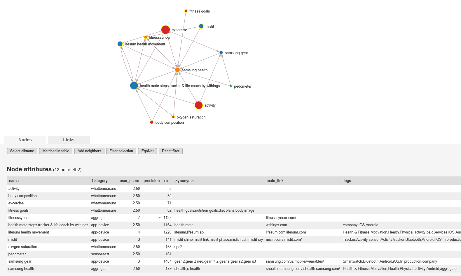
Many options could help clean up. Disable defunct products. Group very similar things together as one node (e.x. smartwatches). Just disable most similar things of a set. Make many separate nets to focus on one part of the network such as all higher level concepts or blood glucose. EgoNet kind of does the last example. Let user setup R and then generate networks or suggestions based on user’s input, such as all ways to flow from blood glucose data to file. And finally I could go looking for a different piece of software; something that could automatically plot the network out better.
We found this problem vexing conceptually, aside from any technical issues. There are sometimes really significant differences between self-tracking tools that have similar names (for instance, two different versions of the Apple Watch, one with heart rate tracking and one without). The tools are then used in projects, where it may be ambiguous whether some particular feature was ever relevant, and it may be unclear which version was in use. These are not rare problems, but rather typical.
1 Like