Mapping QS Data Flows and APIs

I’ve been talking with QS friends and colleagues about how to represent QS data flows so that our ongoing conversation about access can be supported by better information about real cases. The link at the bottom of this post goes to a .pdf of some draft diagrams. I’d be grateful for any feedback. Corrections of errors and comment on the design are equally welcome. If you want to use this approach to make your own diagrams, feel free. We hope you will share your knowledge.

The diagrams are meant to be helpful in two ways. First, they contain reported detail about data access procedures in a sample set of self-tracking systems, selected to expose a range of approaches, and organized by commercial brand. Second, and more importantly, they offer a conceptual model of data flows that can be used by others, including tool makers themselves, to understand and express how self-trackers and researchers may be able to access self-collected data.

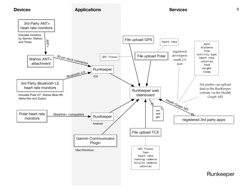
The best way to begin reading the diagrams is by following the data from left to right as it flows through three technological “zones”: Devices, Applications, Services.

A device is an application specific computer, such as an activity tracker. These include the bands, straps, scales, and other gizmos familiar to all of us. It’s important to remember that even little toy-like trackers in a colorful plastic coating are in fact computers running software, and the measurements they make are influenced both by the electromechanical systems they contain and by the software they run. We consider something a device if the software it runs is “baked into” the instrument, perhaps updatable by the vendor remotely but normally invisible to the user.

An application is software running on a general purpose personal computer, where personal computer includes smart phone, tablet, or traditional PC. Increasingly, self-tracking applications can use the native sensors installed in the platform, as iOS applications can use Apple’s M7 chip. Thus self-tracking data flows may not originate in external devices, but instead originate in the application zone.

A service is software running on a vendor’s infrastructure. Most opportunities, though not all, for pulling data out of a commercial ecosystem occur in the service zone. Services are normally accessed by users through web sites, and by 3rd party developers through APIs. Importantly, self-trackers can also add data to a system via a web site, so that new measurements can enter the system from the service zone.

Data types available through a vender’s API are represented on the diagram as boxed text. How temptingly simple these boxes appear! But by following the lines of the diagram backward, the underlying complexity of the data becomes visible. We hope these diagrams will support critical reflection on the common belief that improving access to self-collected data through common APIs, aggregation schemes, and measurement standards will satisfy research needs. Simplicity of access is a dangerous simplicity when it silently erases the provenance of the data. Our diagrams aim to illustrate some of the places where provenance is relevant.

Questions that these diagrams can help answer include:
Can I upload data from a particular device directly into a web site without going through a smartphone?
Can a single data type (steps, for instance) accessed via this API represent measurements made by different devices?
Can data accessed via the API include data from more than one service?

Diagrams downloadable here: http://quantifiedself.com/wp-content/uploads/2014/04/API-Diagrams-Production-Final.pdf

Sample diagrams include: Apple M7, Azumio, BodyMedia, Fitbit, Foursquare, Jawbone UP, Nike, Rescuetime, Runkeeper, Samsung S Health, Sleep Cycle, Withings.

The diagrams were conceived and designed by Robin Barooah, and researched and drawn by Steven Jonas. We are grateful to Intel Labs and the Robert Wood Johnson Foundation for supporting our research, and to the self-trackers and tool makers in the QS Community for sharing their knowledge.

Neat! Next, add partner apps and combine everything into one big spaghetti diagram :slight_smile:

Suggestions:

  • Web UIs/dashboards could be considered to be “applications”, distinct from backend “services”.
  • Should distinguish Web APIs from device APIs (e.g. Bluetooth)?

Eric, thanks for these comments! Say more about “device APIs.” Do you have some examples in mind?

I actually did think about including partner apps, for about 5 seconds. :slight_smile:

Really helpful when researching QS platforms! Do you maybe also have one for the Apple Health app?


Network Graph, from tabular data, with positioning automated by netCoin. That spaghetti diagram but netcoin has some basic clutter removal. Edit: I should present this at the upcoming QS conference!
1 Like

@Steven_Jonas did you see this?

@ejain is the guy with the data aggregation app

I’m thinking about how to use our new QS Show&Tell online format to also create opportunities like the breakout sessions in the QS Conference. This would be a perfect topic for a breakout session.

We’ve been trying to figure out how to map data flows for a long time. But @rain8dome9’s approach is more modern and it would be interesting to explore/add to as a group.

(See pages 45-56 of this report for one attempt—the names of the tools will bring back memories). QSPublicHealth2014_Report.pdf (2.3 MB)

1 Like

As it is my approach can not be as detailed as your graphs. It would be far too cluttered. Runkeeper would not be distinguished by OS. 3rdparty HR monitors would all be connected by individual lines (or to a ANT+ Heart node) with the steps as one continuous string label. Getting and using that Wahoo attachment means those lines will be red for difficulty. Same way info and exact quality of data can be conveyed with more text and thickness of line. All file uploads, except Polar, would be one single arrow from unencrypted file node (“csv file” now). Health Graph API would be clutter of lines except APIs available to end user which is a node.

Often the useful information is in the “clutter”… For example, it’s easy to discover that device x can be used to capture heart rate and that this data can be imported into service y. But what may be less obvious are limitations like “device x is only suitable for capturing heart rate at rest”, or “you can only export heart rate at hourly resolution”.

The color and thickness of the arrow do these things. Vaguely. Its not in th pic but I have added that functionality. Really should have brought up this topic with next update.


Lots more work before its ready but there is a screenshot in passing. I need praise and feedback to keep focusing on the project.

2 Likes

@rain8dome9 I’m away until mid-next week but look forward to exploring. For feedback from a not-especially-technically-skilled user like myself, it might be good to be able to observe the graph in use, maybe in a screen capture. What is the advantage of using the graph rather than the tabular data? Can this be shown/demonstrated?

In tabular data it is completely impossible to visualize a connection between items of more than one step or the neighborhood of an item. The graph also sends more info faster via size and color of node and arrow. Examples; Find inimal number of apps needed to measure all these things I want to measure. Find other things that could be measured to get same idea. Find all devices that measure heart rate and offload directly to CSV. User could use queries but that is not friendly and user could miss other options because of rigidity.

There is a screen capture in the post preceding yours.

Yes, that makes sense. I meant to write “screen cast.” I saw the image, but what I’m wondering is what do I need to do to run/install the graph and explore it? This may be more obvious to others but I’m not certain.

Download the zipped repository and find index.html. It will open into browser and show the graph. Its not this huge on just the colorful one of my stack right now. In a month a cleaned version o f the big graph will be available.

I’d love to see what devices and services tend to be used together in self-tracking projects, similar to the Correlated Technologies chart in the latest Stack Overflow Developer Survey.

Would have to manually extract that data from show and tell talks and project logs…

We have some work to identify “tools used” in the show&tell archive and can provide that in tabular format if wanted. The diversity of tools is very great, as it turns out.

R is a node connected to pandas and hadoop. To get that info would require surveying lots of people and no one except maybe biohackstack has done this (afaik). In future (1 month to 10) I will add the feature to let users fill out a speadsheet to viz only their own stack but that will not be uploaded anywhere.