At long last - I’m posting some results of my baseline network physiology project. This is basically the story of how my data became more erratic/unstable leading up to me getting sick - without me being aware that this was happening.
I gave a talk about it at QS18 (Link to follow) . I’m adding the figures from that talk (and some extra ones) with captions.
My intention for the project had been to capture as many outputs as I could, over several days, in a healthy state. HOWEVER, the day I took my devices off I got sick. I had no idea at the time that I was getting sick (though I knew it was harder to sleep well with all the electrodes on, and thus was feeling pretty done with the process after 8 days!).
Because my background colors what I see in my data…
My background is in biological rhythms (circadian, ultradian, ovulatory). Circadian rhythms are endogenous (created by the body), 24 hour oscillations that occur across almost all bodily outputs. Ultradian rhythms are faster, they occur several times within each day (e.g., sleep cycles every 90 min during sleep, getting hungry a few times per day). It’s not known which ultradian rhythms are endogenous, and they don’t seem to be guided by a main brain region. Ovulatory rhythms obviously take longer (30-40 days in me), but they also play a role. All these rhythms happen at the same time, and we know that at least the circadian and ovulatory ones can become uncoordinated in sickness states…
When I looked at the data, I noticed that the first ~ 4 days of data looked “stable” (I.e., the daily and within-a-day fluctuations looked basically the same day to day), and the latter four days looked increasingly ‘uncoordinated’. Below explains what I mean by uncoordinated :). Another thing that sunk in was the degree to which these outputs’ daily rhythms look like square waves in me rather than sinusoidal curves. A lot of analyses (cosinor analysis obviously), but also the wavelet transformations I use, try to model the underlying wave as a sinusoid. Probably we could do better with a square wave or mexican hat for these outputs!
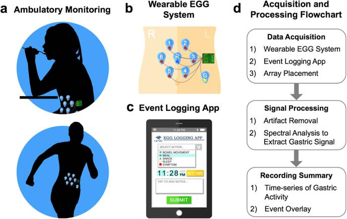
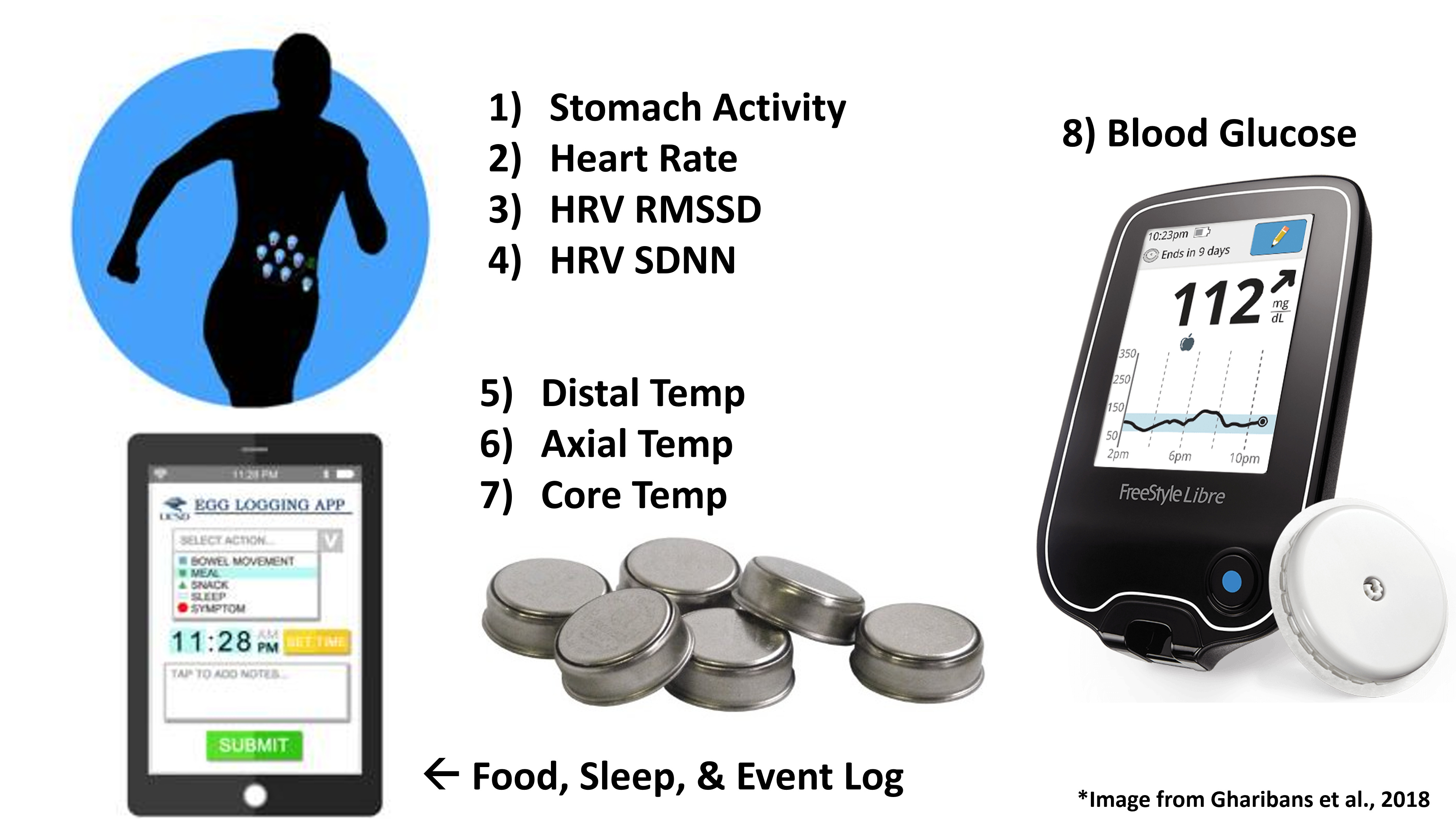
These are the devices I ended up showing data for: electrogastrogram (EGG), BPM, HRV RMSSD (Root mean square of successive RR interval differences), HRV SDNN (Standard deviation of NN intervals), wrist, abdominal, and core temperature, and interstitial glucose. I’m not going into logging of specific events here.
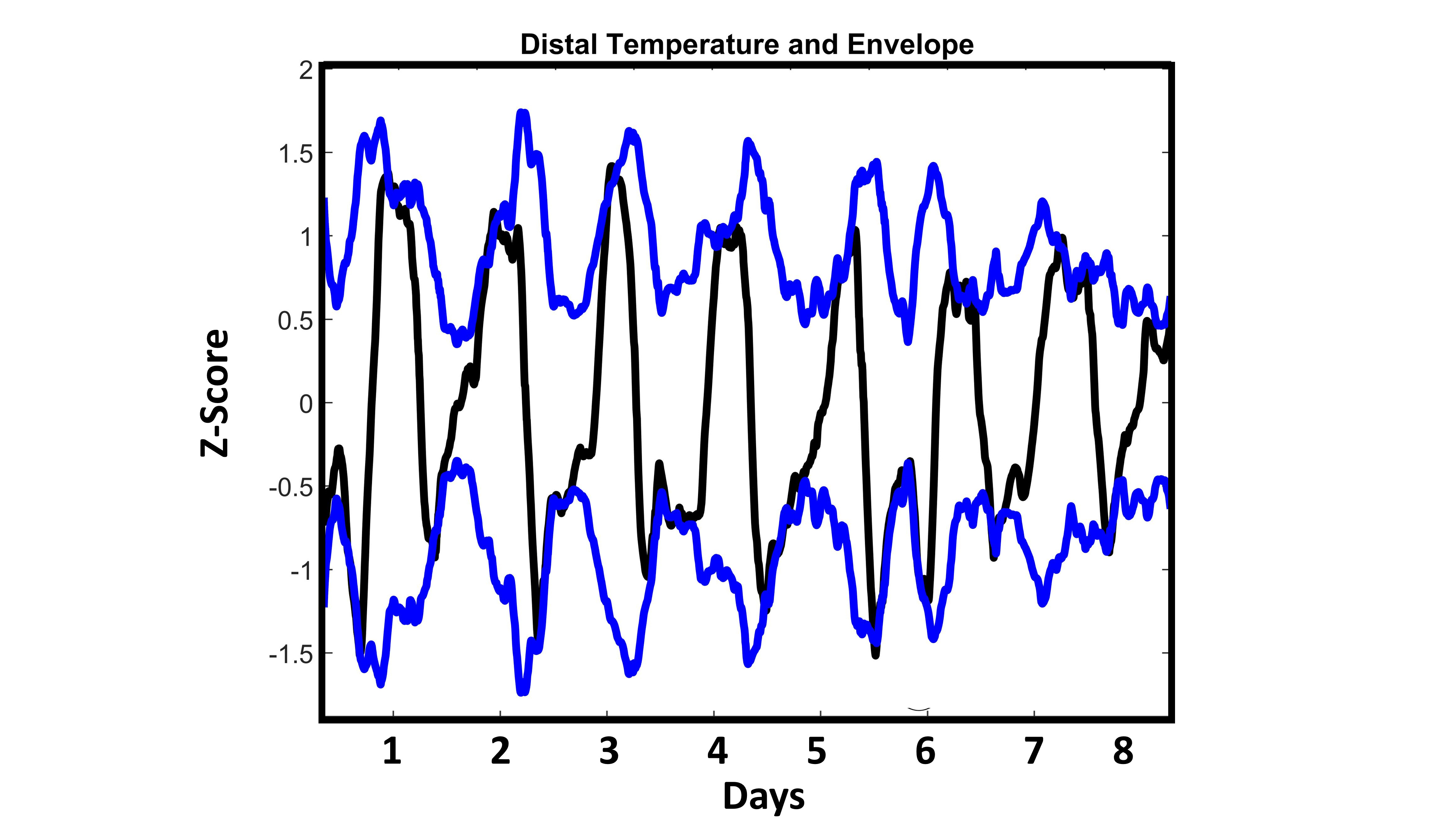
Fig 1:
My distal (wrist) temperature and its “envelope” (consider this a measurement of range). This is smoothed data to emphasize th daily rhythm: each day my distal temp rises and falls in a square-wave-like pattern. The first four days, to my eye, looked similar to each other. The last four days looked like they had a progressively shrinking range. See below
I decided to plot different outputs, and see if anything else looked to change around the 4 day mark. I noticed differences in several different signal parameters (including range, phase and periodicity) See below for more detail.
Fig 2.
This shows 4 pairings of data (out of 28 potential combinations). I chose these to illustrate a few instances of how individual outputs - and their relationship to one another - changed from before, to after the 4 day mark.
Top Left: Glucose and Distal: We saw the distal range compressing in Fig 1. But this shows that, additionally, my glucose jumps up, and loses a lot of the clean daily rhythmicity after day 4. Also, I’ve seen in many individuals that glucose and wrist temperature are antiphase while one is healthy, and that this phase relationship falls apart following jetlag. It looks like that antiphase relationship also disappears in me leading up to sickness!
Top Right: Glucose and Stomach Activity. For the first ~ 4 days, my glucose and stomach are roughly in phase, with glucose preceding stomach by a little. Especially on days 5-7, my stomach daily rhythm is blunted and loses that phase relationship to glucose.
Bottom Left: Core and Distal Temp. In this one the antiphase-relationship is maintained, but my core temperature range starts to drop toward the end of the record. This is the pattern I expect to see for Core in the late luteal phase. Not sure if this is related to sickness.
Bottom Right: HRV and Distal Temp. These two are very well in phase, both across days and within single days. But on days 4-8, my HRV shifts markedly higher, and higher still if one looks just at days 6-8.
How to synthesize this? Keep in mind that with 8 outputs I have 28 possible interactions. Looking at them all and trying to come up with a more eloquent gestalt than “things look mishmibbed in the second half” was hard.
I decided to do wavelet coherence, which is a measure of time-frequency coherence. I did this to try to get one number for each pairing of variables that would tell me how coordinated the within-a-day and daily rhythms were at each moment of time. My idea was that then I could look at the first and second half of the logs, and have a consistent metric of how ‘stable’ the interactions between pairs of my biological rhythms would be.
Here’s an example of what wavelet coherence looks like, and what I did with it.
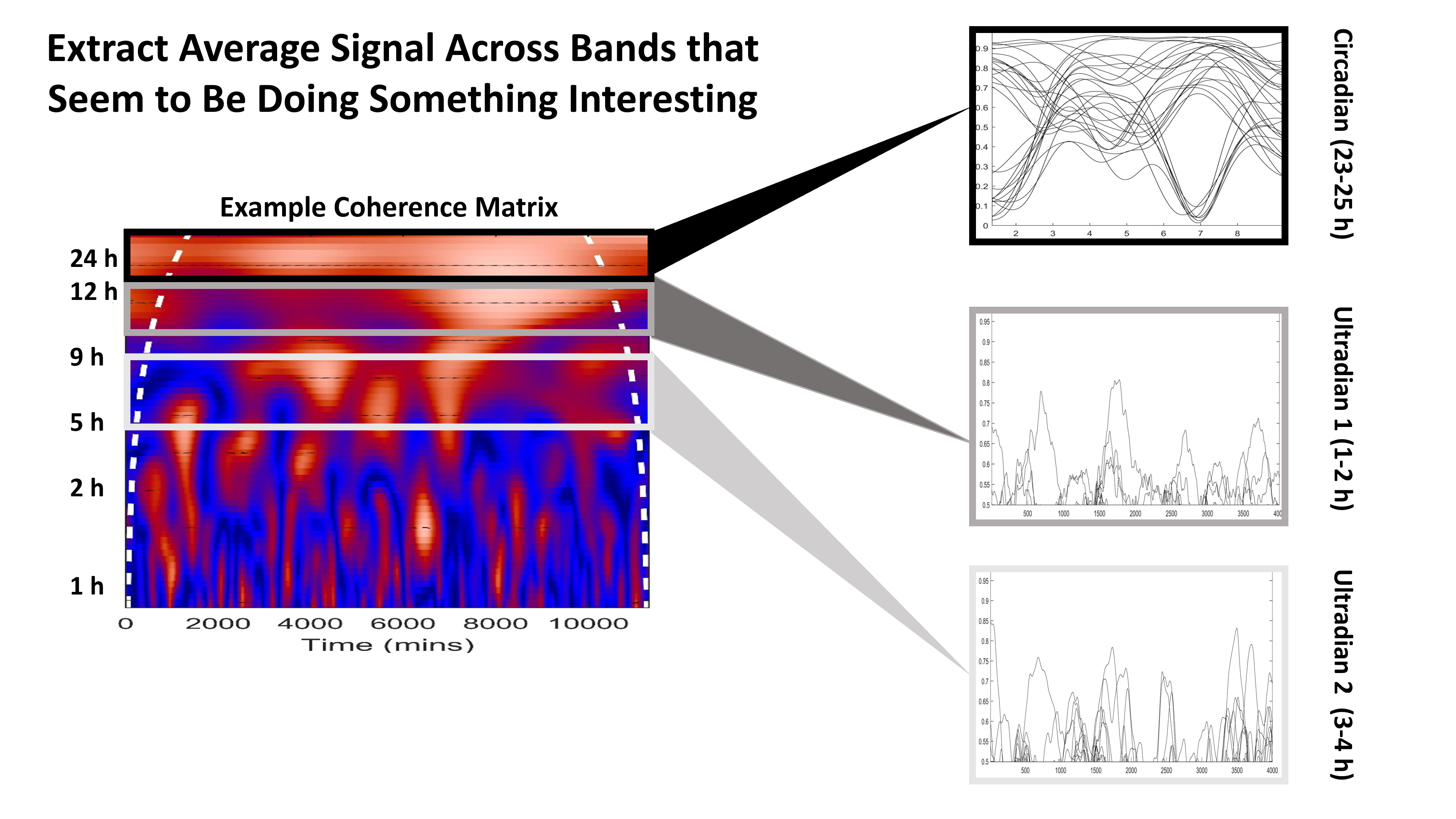
Fig 3.
This is a quick hashed out slide. The X axis is time in minutes,
the Y axis is periodicity in hours. The white dotted line is like a confidence interval - I discard values outside it. For each pair of outputs (28 total), the wavelet coherence is a numerical representation of the degree of coordination among those outputs (red colors are larger numbers, blue colors are smaller numbers). 1 is the highest number (100% coherence). Each pixel in that heat map represents one of those numbers. I extracted 3 periodicity bands : 23-25 hours (circadian), 1-2 hours (ultradian 1) and 3-4 hours (ultradian 2). More on why I selected those ultradian bands in a minute.
Fig. 4
I averaged the coherence metric across these bands to generate these lines. Each one represents a pair of outputs. I could see that a handful of outputs tanked in circadian coordination around day 5-6, and that the changes in ultradian coherence seem… not obvious.
I decided I needed a clearer way to visualize all these outputs’ coordination at once, so I decided to make a graph. In the following figures, each dot represents an output’s rhythm (they are labelled), and each line represents the strength of its coherence to the adjacent output’s rhythm. Red is weak, blue is strong. Thin is weak, wide is strong.
Fig 5.
Here I noticed that my stomach activity was that group of lines that tanked! It seems to really become uncoordinated at the circadian timescale. Some outputs become more strongly connected (Core Temp and HRV RMSSD).
Next, I wanted to make the same plot for the ultradian rhythms. After messing around, I remembered that ultradian rhythms get faster during sleep, and slow down during the day! It wasn’t until I separated sleep and wake, and faster and slower coherence bands, that I figured out what was going on.
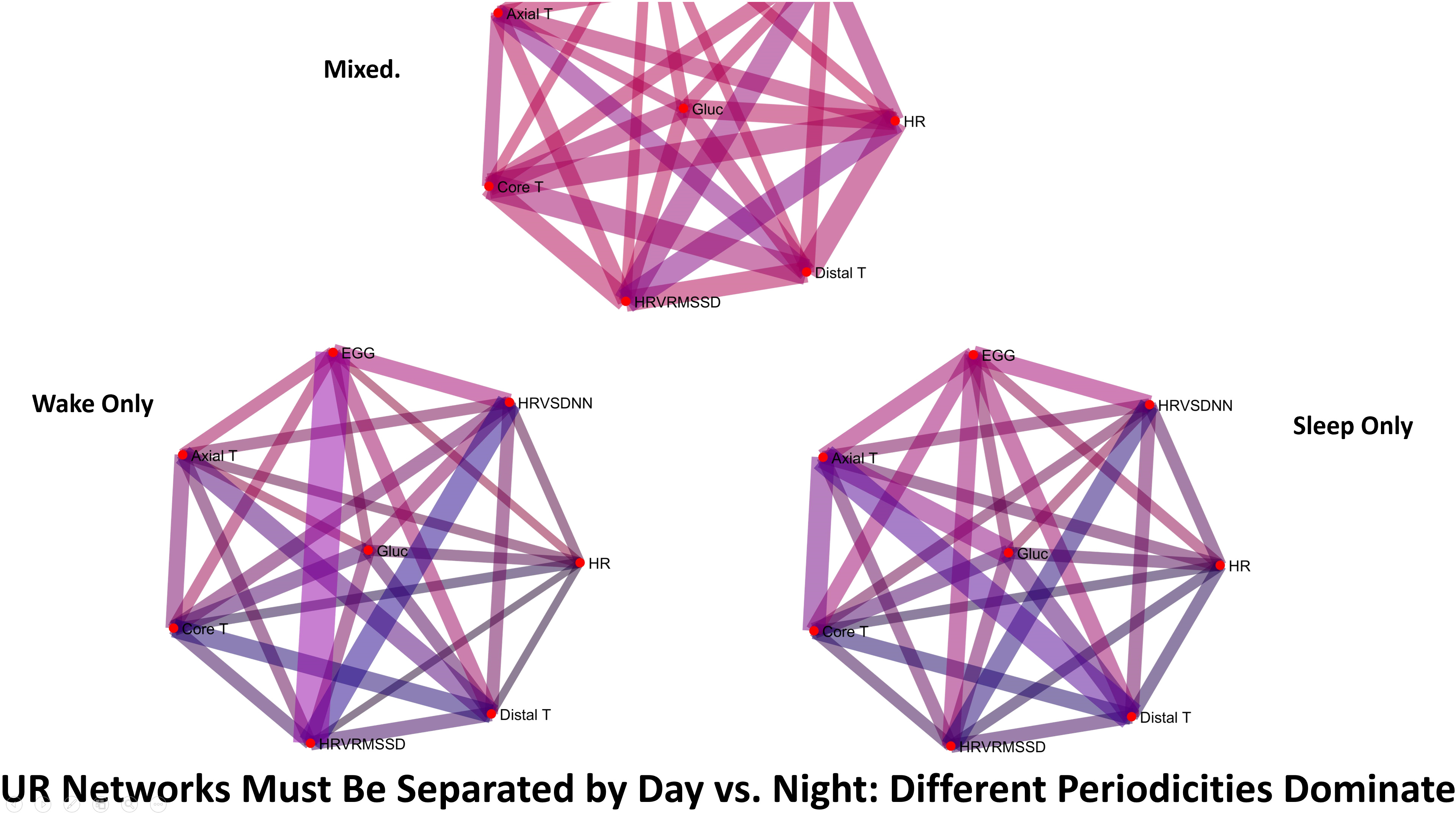
Fig 6.
The top graph (mixed) is the unseparated data. It looks a little like those linear plots - all the lines are pretty pink/red (meaning there is little coordinated activity. The Wake Only graph and the sleep only graphs, however, are much darker overall. Some edges are dark blue, others a darker purple. This seemed more reasonable, so next I split the data into days and nights that were healthy, versus sick.
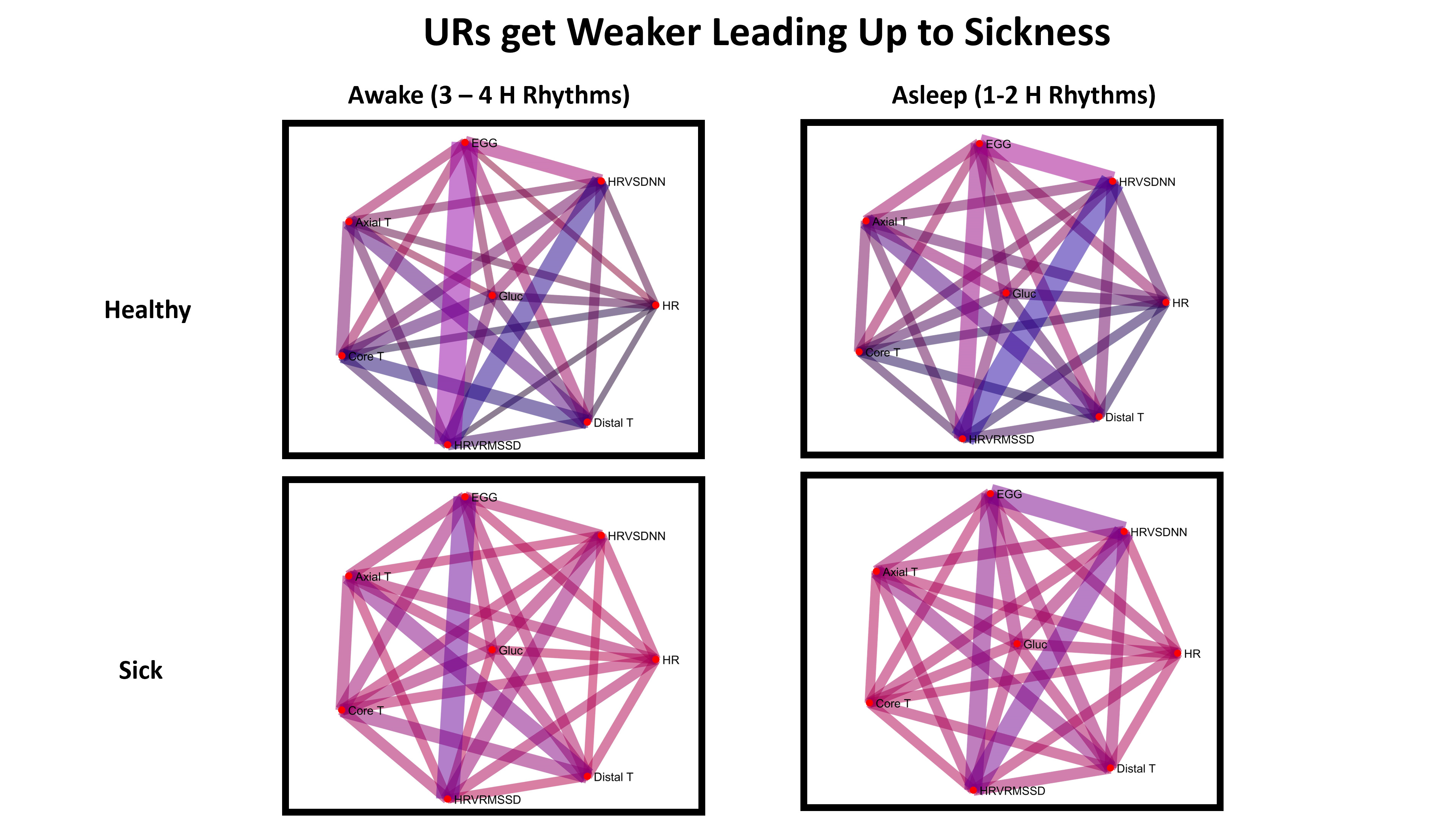
Fig. 7 (Last one!)
This is my favorite figure  On the top row are my healthy ultradian rhythms, on the bottom are the ones that preceded sickness. Overall the rhythmic coordination preceding sickness is much weaker!! I thought this was pretty neat that the whole network loses specifically ultradian coordination !
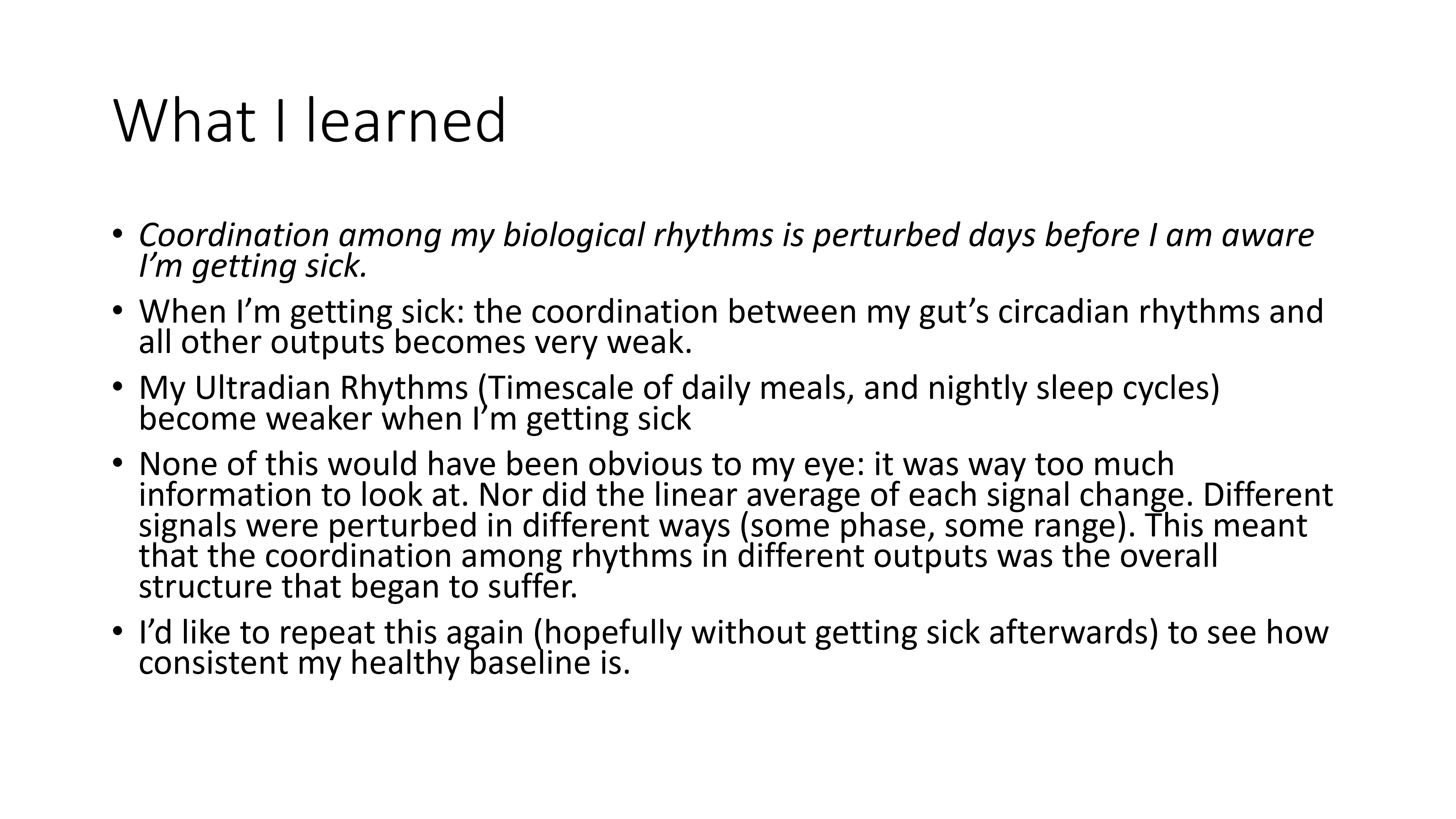
Last, here’s a brief summary of what I learned. I’d like to do more with the data and visualization (e.g., make the node diameter proportional to the robustness of each individual rhythm, or do dynamic time warping as a measure of similarity between each day and the next…)
So thar she blow, if you made it to the bottom of this post let me know what you think! Also if this is confusing, happy to answer questions.
Cheers,
Azure