Dear all,
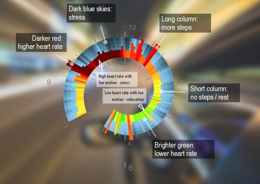
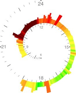
I have been experimenting with the way to display the combination of heart rate and activity data measured continuously during the day. The particular focus was to highlight the periods of (mental) stress, when there is a high heart rate with the low physical activity.
I have one favourite example of such stressful day - driving test. A lot of stress is between 10 and 12 - that is when I am being testes Those snails are currently used to show the Biovotion VSM data.
This specific day actually brought me to the whole idea of the snail design - how you show the data of the combination of heart rate and steps counting / motion and how you will discriminate the Heart rate increase caused by the physical activity from the stress (mentally derived) heart rate increase. The solution was the multiparameter presentation - you use colour to represent the heart rate (response) and shape (length of the column) to represent physical activity (actuator). And then you allow the viewer to make the interpretation himself or herself by figuring out the response function. As soon as the pattern emerge viewer can see the abnormality, like this extended period of the high heart rate without physical activity.
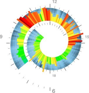
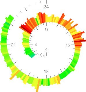
As an add-on for comparison - two examples of the stress spirals for an outdoor day with the kids (a lot of physical activity between 10:00 and around 15:00).
Obviously the heart rate is increasing during activities.
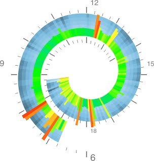
And regular uneventful office day - morning commute to the office slightly before 8:00, going to lunch (12:20) and back (13:10), evening commute before 18:00 and some excitement at home after 19:00. Not that much stress.
Thanks, Eric, that’s an interesting idea. I didn’t have much of the success in packing more than 24 hours in one spiral, the data in the middle becomes too crowded. I’ve ended up creating spiral for a day and another for a night.
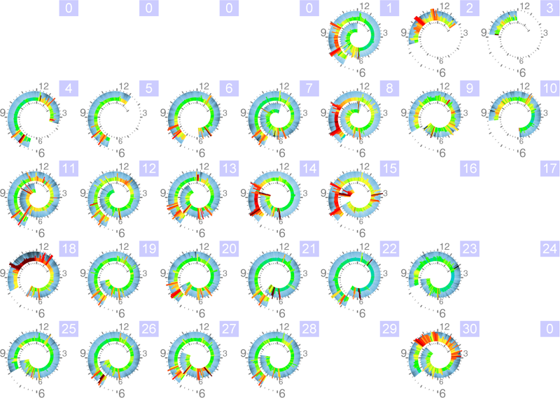
The averaged spiral on the outer ring should probably averaged for a specific day of the week, since it is very much dependent on that. See the calendar plot below for the November of 2013 (ignore the zeros - has to be fixed). I currently have a sky-type visualization of the the HRV-related parameter, which is well correlated with stress.
Why not have each full turn correspond to 24h rather than 12h? Lining up 9am with 9pm seems less useful than lining up the same hour each day (assuming you want to display more than one day).
It makes sense to have time progress clockwise, but shouldn’t data that is older appear further back and smaller?
Thanks, Eric, for sharing these ideas.
Yes, I’ve been thinking about this as well, since the more recent data is then presented in the larger scale, something like below:
The problem with this representation for me is that I’m typically more interested in the data between 8am and 8pm, while I have measurements till late.
That is something interesting. The original idea was to replicate the regular clock face and have the rotation twice for 24 hours. Something to represent the day of measurements for sharing in a graphical form on Instagram or anywhere.
However, alternative time scale can also be an option is one wants to have the multi-day data presented. Can be also done for a week data (one rotation - one week).
I’ll play around with this and share.
You can get minute-resolution data from both the Fitbit and the Jawbone Web API (the APIs haven’t been updated yet to include HR for the upcoming devices).
Thanks, unfortunately they are not selling Basis in Europe. Would be great to get some Steps/HR data from any available device on the market to try visualisation. I’ll look around on this forum to see if anyone shares such data.
 Those snails are currently used to show the Biovotion VSM data.