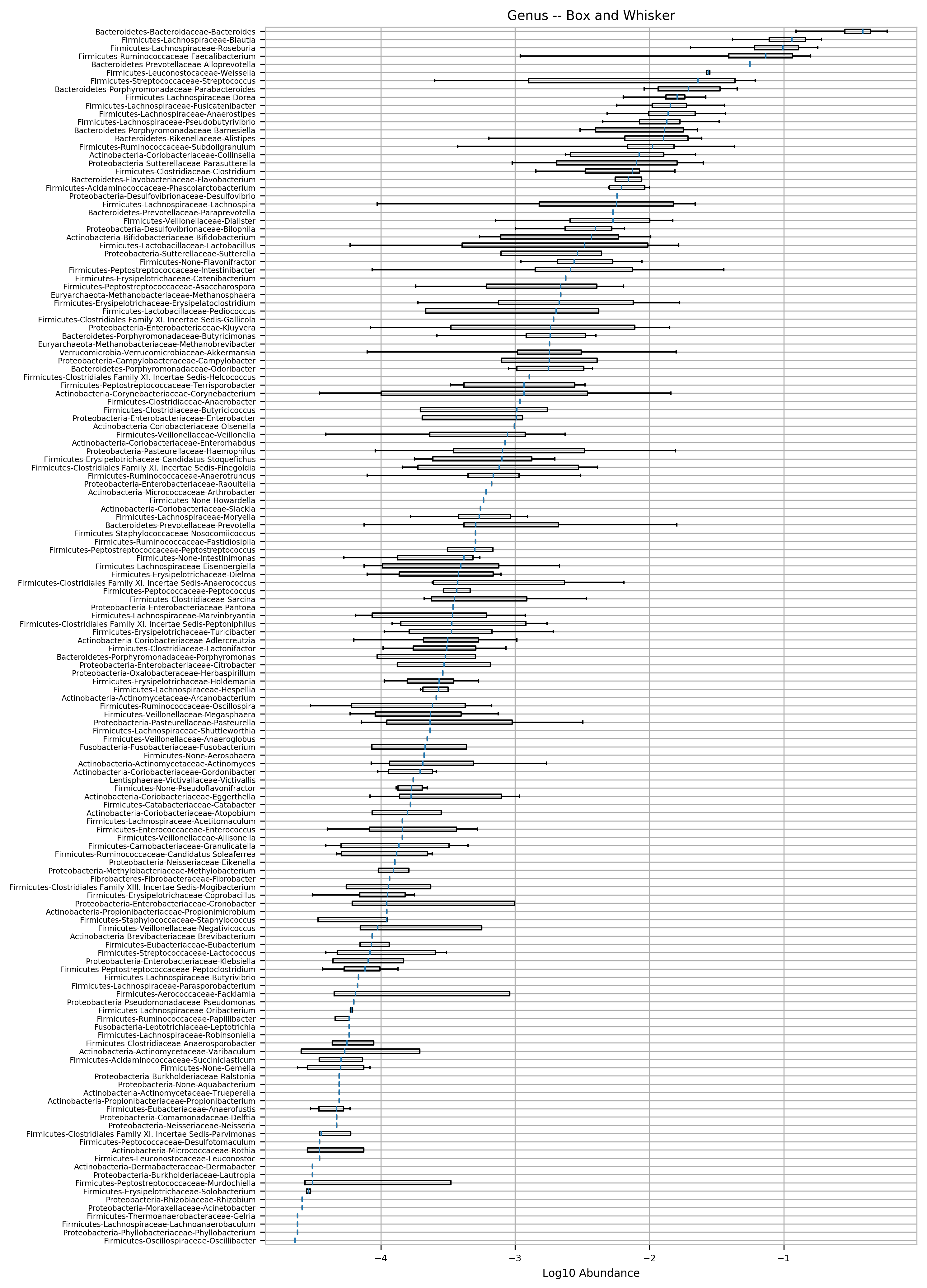
I was playing with different ways to display this data and created this from inspiration from a gut microbiota book Ive been reading.
1 Like
Looks nice, but what is this chart supposed to tell me? 
How many microbiome tests have you had over these two years?
17 samples over the last 2 years.
The chart shows me how variable some bacteria abundances are in the gut.
Is the blue line abundance?
blue line is the median of the distribution. The box bounds the middle 50% and the whiskers are the 95% interval.
This kind of chart would be great to show how bacteria vary in a sample population of 17 people, but to quantify variability over 17 successive measurements, it might be better to calculate the ®MSSD for each genus? Otherwise you can’t distinguish between a genus with large up and down swings, and a genus that has been creeping up (or down) steadily.
It would but the problem you have is that sampling varies quite a bit week to week and even where you sample on the stool. Most abundance are neither decreasing or increasing but appear randomly distributed.
Otherwise you can’t distinguish between a genus with large up and down swings, and a genus that has been creeping up (or down) steadily.
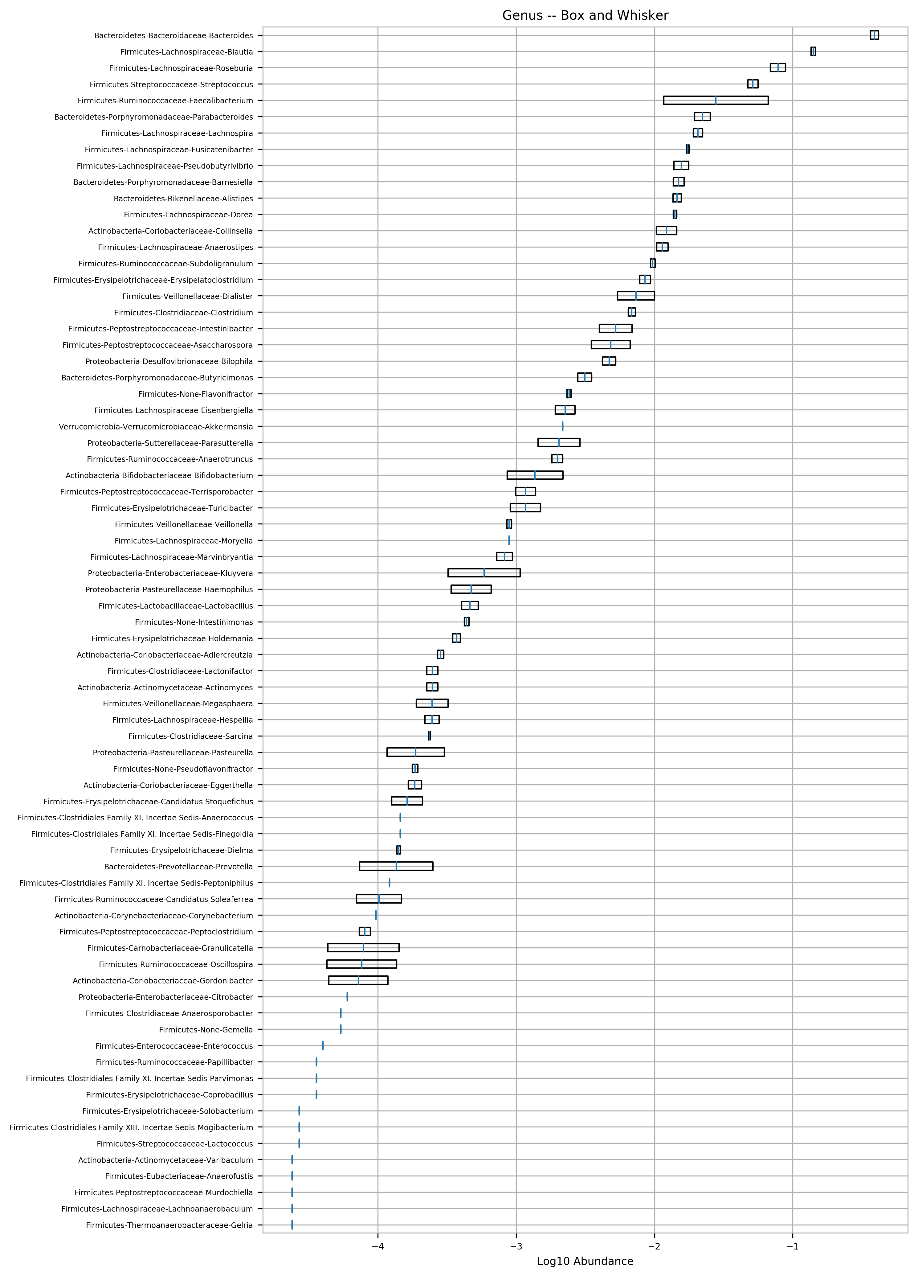
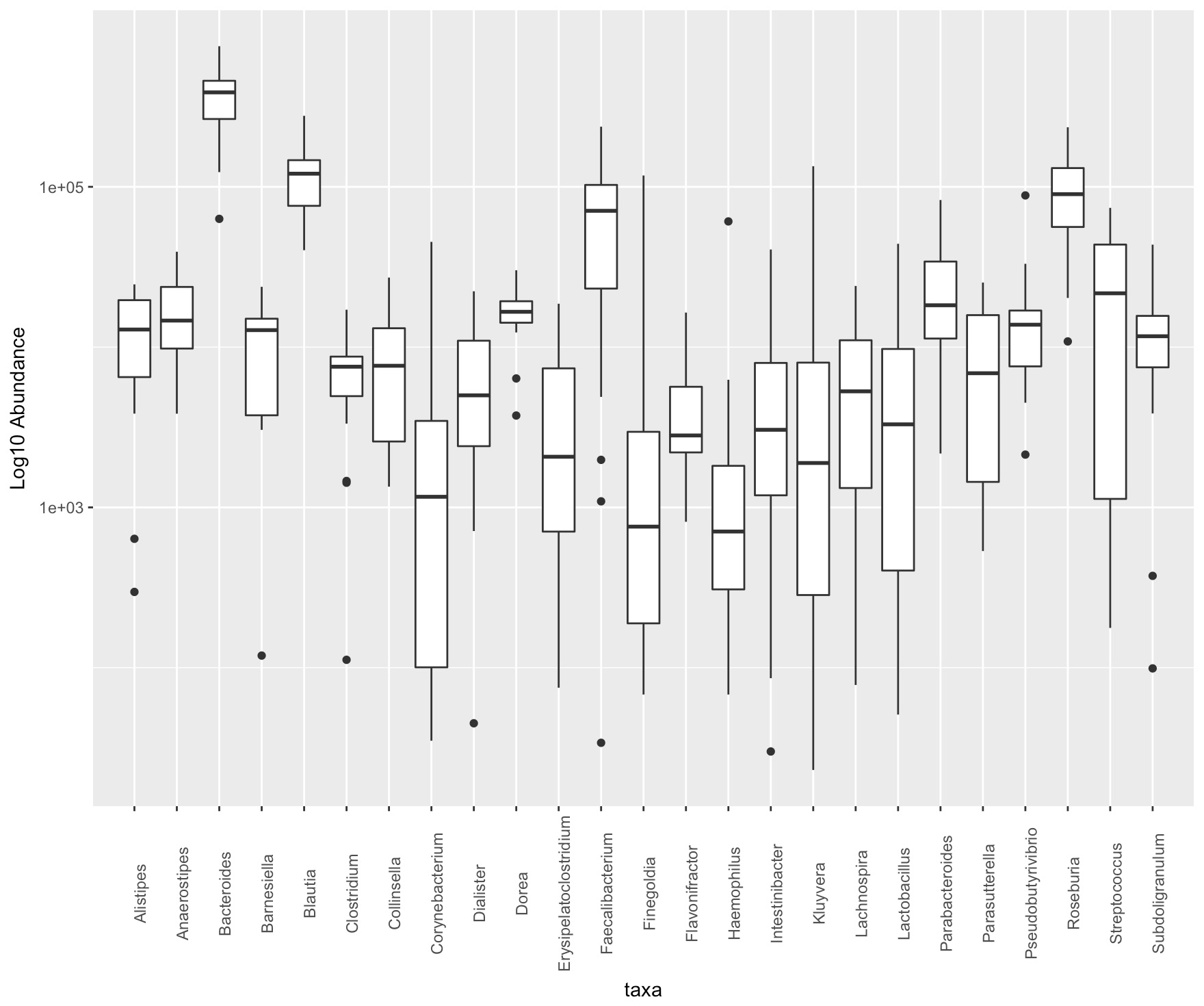
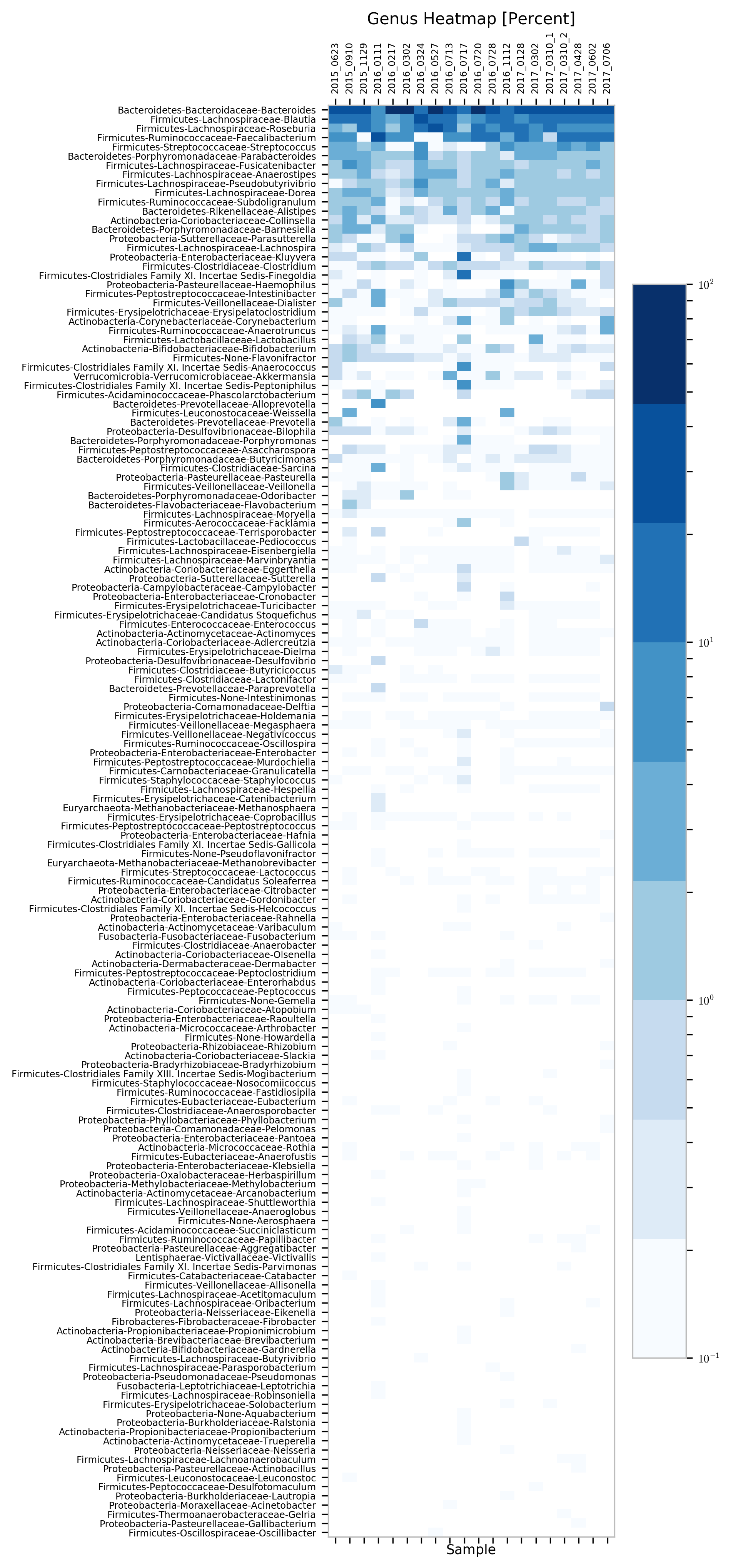
You are right, but I have not seen this the data I have. See this plot for another view of the same data. https://raw.githubusercontent.com/isaacgerg/ubiome_longitudinal_analysis/master/sample_data/genus%20heatmap.png
it might be better to calculate the (R)MSSD for each genus?
This has been suggested to me also but i find it not that useful. I have also tried using SSAM and its results are just okay. But, when i think about what these metrics measure, I think a more appropriate measure would be to look at the DNA and see what proteins are most common between the samples. This would tell me how the function of the microbial community changes over time – you can have the multiple bacteria perform the same function so if one leaves and another grows nothing has really changed.
1 Like
Cool!
Is this your data?
It’s your data that I pulled from Github.
Even cooler!
Have you considered generating this plot on your data?