Hey!
Excuse me if I am asking a question that has already been asked.
I have some kind of allergy or disease, due to which redness and skin irregularities. One of the doctors advised to observe the food intake in order to identify what is the cause of the disease. I have guesses so far, but to be sure I need more data. I started looking for information on the Internet about ways to record events in a person’s life and found such concepts as “lifelogging”, and then “Quantified self”. I realized that there are many programs that allow you to record data, but I have not found suitable programs that allow you to conveniently analyze the previously recorded data.
I need to record data (events), and then I need to get data (events) for a certain period of time and identify the correlation between two or more events, and then visualize it all in the form of some kind of graph. Thus, I could guess the cause and effect of the events.
Are there any programs that allow you to do this?
PS Preferably online
PSS google translator
This is precisely why I started working on Lytiko (lytiko.com). You basically represent everything as a time series, one of five different types, and there’s an algorithm which detects basic correlations. It’s at a very early stage right now though, so it depends how complex the correlations are that you would need to identify.
One of my particular needs was quite similar to yours, in that I noticed I was getting intermittent tooth sensitivity in one tooth that seemed to be connected to what I ate - lytiko narrowed it down to a particular kind of apple, which I thought was quite cool.
Anyway, sorry if this comes across as a pitch - I don’t make any money from lytiko, just wondered if you’d find it useful.
Thanks for the answer. When will your service be available? I would like to see how this works, how the data is displayed, and how flexible this visualization is to customize.
Hey Guys, we’re building Vital you can connect all your wearables for free and get a unified API to pull all the data. Would love to know if there’s anything we can add like correlations etc?
Did I understand correctly that your service is needed in order to be able to receive data via API from several sources at once and that data from several sources turns into a single structure, into a single data format?
Correlation analysis isn’t just calculating correlation coefficient and make decision on that value. There is some situations when its may not be applicable:
Non linear relationship
Small sample size
Big outliers in data
Take into account that there is a few types of correlation coefficient (Spearmans, Kendall etc) and deciding which you should use depends on type of your data.
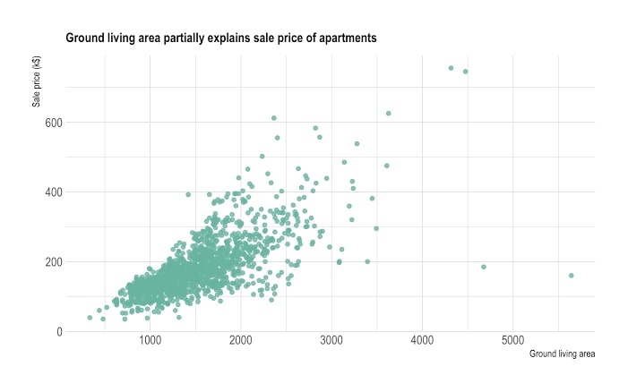
First of all its recommended to look at data. Just plot values in scatterplot graph. This can be done in google sheets / excel and looks like that.
If you see some linear trend and your data is continuous, than Pearson correlation coefficient might be useful. It can be calculated in google sheets. If you have a bit of huge outliers, it may worth to remove them.
No matter - have you found correlation or not, you should check if sample size is enough. Good correlation with a small sample may be a random noise, no correlation at all with a small sample may mean we havent gathered enough data to detect it. There is no simple advice on how to check that, some learning of statistics may be needed.
If you are comparing same dataset with different variables you should address a multiple comparisons problem.
Dont trust too much in tools which just show you just single number (correlation coefficient) and doesnt measure how accurate is it.
Thanks for the advice.
I read about different kinds of correlation. (Pearson correlation and so on). In addition, I studied statistics at the university and still remember a little from that time. I understand that correlation should be done on big data and that correlation does not always equal cause or effect. I will remember this when making conclusions.
About Excel. Excel gives great opportunities, but manually calculating and plotting charts in Excel is not convenient for the end user, especially from the phone.
I would like to know if there is a program that receives data and in which it is possible to build various kinds of correlations between several arrays?
For example. The user has added data for the last three years. Now the user wants to know the closest correlations between any two datasets over the past 8 months. The user simply selects a start date and an end date, then clicks the “calculate correlations” button and the program displays (for example) the five closest correlations for the selected time period using different correlation calculations (Pearson and so on). The program displays graphs and odds.
It is better to have a website, thus there will be access from any device for data entry and for viewing charts.
At the moment I found a site - Zenobase, I am still exploring its features. But if you know any other sites or programs, please write here.
I’m using Rstudio. If you have csv it will take few lines of code to visualize and test for correlation. You can google simple rstudio tutorials for correlation / plotting values. Example of how it may look (with R code): 2 parameters, plot values, build linear model and correlation test (i’m just learning statistics and may have mistakes).
I dont think there will be easy to use online solution which calculates p-values, confidence intervals, picks appropriate method, adjusts for multiple comparison, etc. Mostly online dashboards may be useful for generating ideas by looking at graphs, but their analytical capabilites is weak.
Thanks. I understand that tools like Rstudio provide great analysis capabilities. I’ll try someday. Still, I would like to use something more user-friendly to start with.
Hi @User195 — Max and I are discussing methods in other topics and we have somewhat different (but perhaps not incompatible!) ways of thinking about challenges like yours. Max is advising on statistical issues, which are especially relevant since you opened the topic with a request for a tool that would offer web-based support for statistical operations. My advice would be to go back a few steps and work on the question formulation first, before moving to data gathering and statistical analysis. As an exercise that may help, I would start with the capacities of Zenobase in your mind and think about a project design whose analytical phase used only Zenobase affordances and nothing more. The reason I suggest this (perhaps absurd-seeming) constraint is that @ejain, who wrote and maintains Zenobase, is a very experienced self-researcher and is a member of the QS Forum, so you will not only be starting with a tool that has been made based on a lot of practical knowledge, but its creator may be able to discuss issues with you here.
So, what does this constraint mean? In general, it means you’ll be working with pretty simple time series plots. So your questions should probably not be too complex. You won’t be looking at large numbers of variables and trying to pick up relative effects over arbitrary time windows accounting also for delayed effects and rhythmicity, for instance. Instead, you’ll be making some reasonable guesses about what might affect your skin and then collecting observations for some time that will allow you to generate new ideas and also refine the ideas.
The most important thing to track, if you aren’t already, is a measure of the skin irritation. Do you have a quantitative measure of this going already? Have you tested it in practice; that is, are you able to confidently evaluate the severity of the condition using your scale of measurement without causing too much friction in your daily life? If you’ve been doing this for a while, you’ve already made a great step forward! The next step, which you may have already done, is just to plot this single variable to get a feel for the typical range, the frequency and severity of the more extreme measures, and cyclical factors. Just looking at this plot (which Zenobase can make, but so can any spreadsheet program almost), can generate some good ideas to test.
Third step, would be to think about the second or third data source you’d like to use. I’ll stop here in case my advice is misguided. What do you think?
This sounds rather useful. I signed up for the waitlist. Looking forward to demoing the service. Do you think you’ll offer paid subscriptions for extra features and support?
those are issues with just correlation in general. You need to look up much more complicated stuff like econometrics cross-correlation and unit root if you want reliable time series correlation.
those are issues with just correlation in general.
Since the topic starter asked about correlation my answer is related to correlation, “in general”.
I’ve listed only few issues, but not all fo them. There are more, like heteroscendacity and error term autocorrelation, but they arent easy to understand without stat background. Correlation generally bad at detection non-linear relationships.
Real world is not simple and mostly non-linear, so correlation is not a graal for casual user who knows excel.
You need to look up much more complicated stuff like econometrics cross-correlation and unit root if you want reliable time series correlation.
I’m already reading stat books, most of them have check-up list for correlation / regression analysis assumptions which should be checked and i’ve gone through that list few times. I dont think they should be written and explained in all details in that topic.
Forgot to reply here! But yes, its a bit more than that we let you aggregate the data, we then standardise it and also give you access to sending at-home lab tests via our API. We’ve built integrations with the likes of Libre and several other manufacturers of wearable devices.