Sharing my odd collection of custom-built, self-quantification software

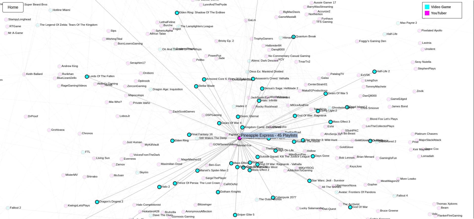
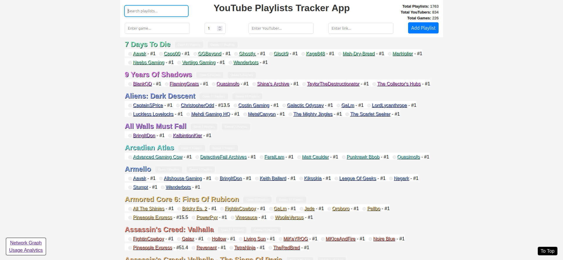
For the past three or four months, I have been working earnestly to build data processing and visualization tools. For uses cases ranging from OSINT to audio analysis. And beyond.

With this thread, I would like to occasionally post an update that explains a new free and open source self-quantification tool that I have developed. This approach is in contrast to sharing each application individually. Which I had done previously with my Pi-hole data thread.

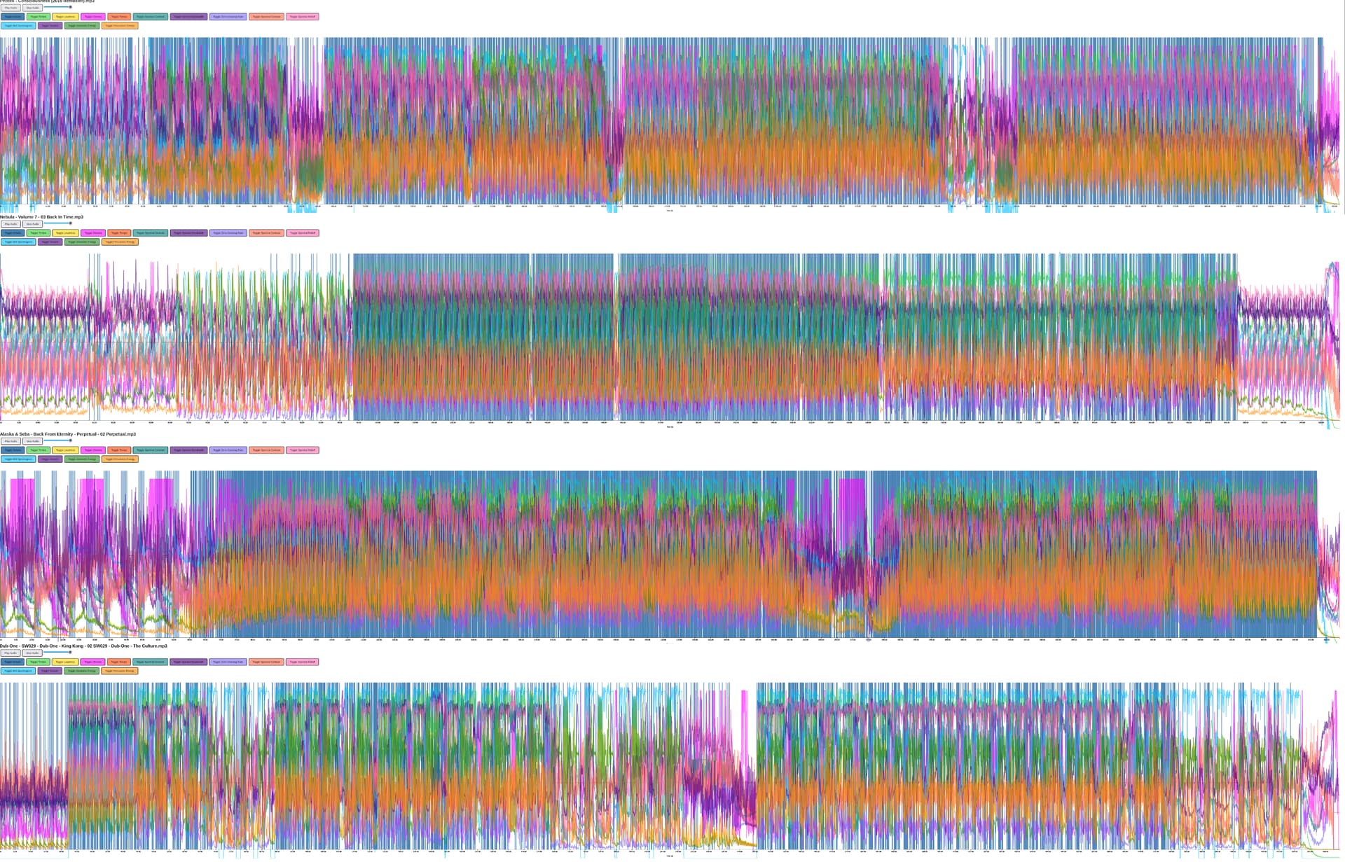
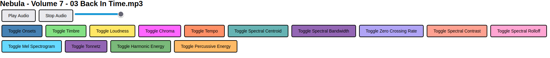
To help get this conversation started, I would like to offer an excellent example of quantifying common everyday experiences. In this case it is listening to audio on your computer. The difference here, is that there are nine metrics that have been visualized as line graphs, along with an interactive audio playback feature.

The nine metrics that are being displayed for any given audio file include onsets, timbre, loudness, chroma, tempo, spectral centroid, spectral bandwidth, zero crossing and spectral contrast.

If you would like to view the source code for a previous release of the software explored in the above YouTube video, here is a link to the related GitHub repo. The version that is shown in the video, is still unreleased.

3 Likes

I have significantly expanded the audio analysis and visualization software mentioned in my previous post. To help explain, I would like to share a screenshot from after having processed and displayed four Drum And Bass tracks on my own computer.

Here is that screenshot:

I personally think the visualization aspect of this program is rather beautiful. And capable of showing how each and every audio file has its own fingerprint, albeit through the lens of data.

1 Like

What are the items in the legend? I zoomed in but the photo is a little bit too low of a resolution for me to make out what it says.

What led you to want to create this type of analysis? It seems pretty cool but as a non-audiophile I can’t really imagine what to use this for.

1 Like

Here is a closer look at those colorful squares, which are actually buttons that toggle each measurement on and off.

The primary (and original) intended use case for this software was to visualize electronic dance music (EDM). Drum And Bass in particular.

2 Likes

That’s really interesting! Thank you for posting about it.

2 Likes

Another related software project I have been working on is the “YouTube Playlists Tracker App”. It works by entering a game title, video number, YouTuber name and playlist link. Which are then organized and printed alphabetically, by game title. The number next to each YouTuber’s name represents the last video watched in that playlist. Ultimately this is how I track my viewing progress for different video game playthroughs.

Future versions of this program will include data “widgets”, to help users understand how the application has performed. Please visit the GitHub repo if you would like review the code and/or use the tool yourself.

Here is a screenshot of the application’s frontend user interface as it stands right now:

With the intended use case aside, this application could be used to collect and quantify any variety of hyperlinks.

1 Like

Since I last posted, the “YouTube Playlists Tracker App” has evolved significantly. And I would like to share those changes with you.

The first/main page has two new real-time metrics; “Total YouTubers” and “Total Games”. With each value updating to reflect the playlists shown on a user’s screen at any given moment.

But it is (in my opinion) the new network graph page, which demonstrates how this tool has improved. The network graph page offers an interactive visualization of how individual YouTubers are connected to specific games.

Additionally, when hovering over a node, all first degree nodes are highlighted. While all other nodes are greyed out. To help emphasize smaller networks of connections.

In the near future, I will be developing tools for exploring the usage logs. Thank you for the opportunity to share this progress with you.

3 Likes

Could I use this tool for something other than video game lets plays or even youtube?

1 Like

Great question.

You sure can. This tool can technically be used to collect, catalog and visualize connections between and your activities among any kind of hyperlinked resource. Would you like assistance with using it in a new way?

I would like to see an example posted here.

1 Like

For demonstration purposes, I made changes to the printed labels used by the program, in order to make the application more generic. But I have not changed any of the mechanics of the app itself. I mention this to emphasize you can use the tool for organizing any type of hyperlinks you choose, without making any changes to the underlying code.

Ultimately, any user of this app can substitute “Game” with “Category” and “YouTuber” with “Resource”. By doing so one is able to collect, catalog and interact with any variety of hyperlinks. Technically the only limit to what the program can handle is the user’s computer.

Within this first screenshot you can see the game titles are now categories of links. And the game playlists are now different webpages and/or websites I want to organize; for whatever my (or your) purposes may be.

In this second screenshot, you can see the network graph of the connections shared by those resources and categories.

With this tool, you are able to catalog and explore any type of hyperlinks, based on whatever categories you are interested in creating. And the program will adapt to those saved values.

Edit:

I am noticing the metric labels at the top right of the first screenshot are incorrect. I should have fixed that issue before publishing this post.

However, I think this example is still useful for showcasing the tool’s flexibility.

1 Like

Could it do this automatically by following my browsing history?

That could technically be done and seems like an interesting idea.

It would take some significant modifications of the code to accomplish what you’re looking to do. And likely require a browser plugin.

I’ll keep that idea in mind for version 2.0.

Hello all. I would like to provide another update on my progress with the “YouTuber Playlists Tracker App” I have been developing recently.

I use this software every single day, to track my viewing progress with video game playthroughs on the YouTube platform. But, as has been explored here, this work-in-progress application can be used to organize and explore any variety of hyperlinked resource(s).

The main UI of this application is the interactive list of Internet resources one might be collecting. Such as the video game playlists I enjoy watching on a regular basis.

The second main page, is the network graph. Comprised of the interrelations shared between (in my case) individual YouTubers and game titles. From which I shared screenshots in a previous post. But here is another example of what I’m referring to, for context.

And here is another screenshot of the improved hovering effect this page now has. Intended to be a data exploration tool. Not yet quite perfected though.

The big change since we last chatted, is the “Application Usage Analytics” page. Home to thirteen different metrics, visualized over time; as well as a word cloud of searches.

Here are three other graphs contained within this page. Those being the number of times the “Network Graph” is accessed, number of actions per hour of the day and number of actions per day of the week.

As a last visual, I would like to share hints from six other data visualizations from within the same page. Including the number of playlists added over time, number of playlists deleted over time, number of searches over time, playlist updates compared to playlist deletions, a word cloud of search terms and number of times the “Application Usage Analytics” page is accessed.

Powering these visualizations, is a local CSV file, containing a record of almost every action taken throughout the app by the user. The CSV file associated with my instance of this tool is already one megabyte in size. After less than two months of use.

With all of that said, I appreciate the opportunity to share this quantified self tool with you. It has been a delight to build this application.

1 Like

Nice graphs!

1 Like

Thank you. I am using a CSV file (as well as a Python Flask server) to capture my usage data, and D3/JavaScript for displaying that information with these graphs. It turns out I refer to the analytics more often than I would have expected.

Edit:

As of this morning, the fourteenth graph to be added to the Application Usage Analytics page is titled “Activity Heatmap By Hour And Day”. Here is a screenshot of this visualization:

I recently returned to the audio analysis application featured at the top of this thread. Though, this time, I am using the data from the JSON file produced by the program, to add video content to the audio. All in perfect sync.

As an example, and in keeping with the opening theme of this odd collection of software, I relied on a Drum And Bass track for material. If you would like to watch the associated video file, here is a link to the media; as hosted via my Photobucket account.

The long-term goal of this particular coding journey, is to inspire an entrainment effect in the viewer/user. Which will eventually be accomplished by appropriately pairing distinct audio and video files, based on the measurements taken.

I hope this all makes sense at this point. More to come soon.

A more practical and revealing self-quantification project I have resumed developing, is a collection of Python and JavaScript (D3.js) programs intended to assist in analyzing/understanding my Pi-hole DNS records. You can find the scripts in this GitHub repo. There are also updated instructions, in the previously linked Git repository, on how to export your Pi-hole data for use with these tools.

As an example of what I’m working on, here is a heatmap featuring the relative volume of DNS queries I made during a week (randomly) sampled from my data. Where each square represents a ten minute period of time. And the darker the color, the greater the number of requests made.

With this next tool, I can explore all of the subdomains I have connected to (across all devices, or by client) as an expandable tree graph. In the screenshot below, we are looking at the various Google.com subdomains I have connected to recently.

For a third demonstration of this project, below is an hourly graph showing the number and type of DNS status code(s) my Pi-hole has produced over the sampled period of time.

These kinds of utilities enable users to more efficiently discover trends within their internet browsing habits. I can clearly see a number of my habits just by looking at the image files shared above. All of this is rather interesting to me.