Sharing my odd collection of custom-built, self-quantification software

I appreciate your support. Thank you for the comment.

There will be more self-quantification software projects in the near-future. Ideally involving sensors and geolocation data.

Edit:

Tonight I found a recently uploaded YouTube video, describing a self-quantification hardware/software setup involving sensors and Raspberry Pi computers. Which is, everything considered, rather similar to what I would like to do next.

Here is the video:

1 Like

I am glad others find this sort of software experimentation interesting as well. Thank you for your comment and positive feedback.

2 Likes

I recently acquired a Raspberry Pi Zero and second generation RPi camera. Although I was initially unsure about the hardware, the Raspberry Pi camera now looks outside through a window in my home. And can stream a secure video feed to any other computer on my LAN.

But I wanted to go deeper, to turn the camera itself into a self-quantification tool.

So I wrote a program with Python, that utilizes the RPi camera to take measurements of brightness every thirty seconds. Then save each record to a CSV file (with timestamp and brightness values) for later analysis.

What you see below are the first thirty two hours (or so) of collected data. The x-axis is “time”, whereas the y-axis is “brightness”. And each calendar date has its own color:

I am initially running this brightness detection program for seven days. There may be, however, reasons to extend this experiment further. To perhaps a month’s worth of measurements? That would be interesting to see visualized.

Would be interesting to see several years of worth of data.

Here in the UK we have been experiencing “anti-cyclone gloom” for a week or more which would cause the brightness level to be much lower than average.

1 Like

Indeed it would be interesting to visualize that much information. Especially if data could be gathered from multiple locations simultaneously.

Based simply on two nights worth of measurements, it is possible and interesting to see different, consistent ambient light levels. Here is a screenshot of what I’m referring to:

Not only can we see daylight hours getting shorter, one night was clearly darker than the other.

Edit:

Here is the final visualization from four days of taking measurements:

Next I will be using the same Raspberry Pi camera to measure both brightness and color temperature, every thirty seconds. I will then graph both sets of measurements, overlaying each other, for a more interesting readout.

After my next self-quantification experiment, I will likely have acquired numerous other RPi sensors. And will be putting them to work as well. Who knows what sorts of insights we’ll discover?

2 Likes

Wow, that’s pretty cool!!!

1 Like

Would still love to see longer periods on those graphs for example seasonal variations rather consecutive days.

1 Like

I’m glad you think so. Working with a Raspberry Pi and the associated camera has been pretty eye opening in terms of what can be done. Especially with Python and JavaScript.

More interesting projects to come soon.

1 Like

Agreed.

I might build a more permanent installation/experiment to capture data over such a period of time. Just need to work out a couple of details.

1 Like

Hello everyone! I continue working towards further experiments with my Raspberry Pi computers and newly acquired environmental sensors. In the meantime, I have also been building a project related to open source intelligence (OSINT), using Python and JavaScript.

The tool (found on GitHub) is referred to as the “OSINT Searches Tracker”. Ultimately, it is an application for organizing and analyzing saved queries made to four different platforms; YouTube, Bluesky, Reddit and Google.

Other details aside, here is a screenshot of the self-quantification aspects of it:

On the left side of the image above, you see hyperlinks to (redacted) time-based searches for different social media and information platforms. Which is a strategy I use for staying up-to-date on the subjects I am interested in.

In the center of the screenshot is the “Stats” popup, containing two visualizations with three weeks worth of usage data. The line graph is a breakdown of the number and variety of activities I have been engaged in with this program. Whereas the bar graph displays the platforms my searches have been on, as well as their respective volume(s).

And at the upper right you see some of the other primary UI elements. Including the ability to search through my keywords, add new ones and perform more complex combination searches.

1 Like

Yesterday I purchased the soldering equipment needed to connect header pins to the Adafruit temperature sensor used for my next self-quantification experiment. Which involves recording temperature measurements from inside my home every few seconds, over an extended period of time. Then visualizing said data to find patterns.

Instead of posting regular progress updates in this thread, I have opted to use Hackaday.io to document my (current and future) project(s). If you would like to follow along for a detailed overview of proceedings, here is a link to the Hackaday.io project page.

I will be sharing the end results from this experiment on the Quantified Self Forum as a response to this thread. But likely nothing until then, to keep posts to a minimum. Looking forward to sharing the final outcomes.

Good morning all! I wanted to provide a brief update on my current self-quantification experiment, using a Raspberry Pi Zero 2 WH computer and Adafruit MCP9808 temperature sensor.

For the past three weeks, I have collected ambient temperature readings from inside my home once every second. Resulting in 1.77 million measurements. To help me explore this data, I have developed a number of interesting graphs using the D3 JavaScript library.

For example, here is a screenshot of average temperatures on an hourly basis displayed as a line graph:

For another perspective, here is a screenshot featuring a heatmap, which visualizes temperatures for an average twenty four hour period; sourced from twenty one days worth of data:

In addition to these two graphs, I programmed heatmap visualizations for each day measurements have been collected. But those are, in my humble opinion, less interesting and relevant than the two charts shared above. At least in the context of this post. Except to say, each day has its own unique “temperature fingerprint”. Similar to the outdoor light measurement project, shared in an earlier update.

Ultimately, this is just the tip of the iceberg regarding what I would like to accomplish with building customized hardware and software for my self-quantification purposes. A larger goal is to complete and document ten of these DIY experiments, using various measurement tools and the Hackaday platform. As I assume I will learn important lessons about how to design, develop and deploy computer/application combinations of my own making.

This current project will be coming to a close within the next two weeks. Once it is finished, I will update this thread with my final observations, and information concerning the next such project.

I appreciate the support the Quantified Self Forum has shown me; being a major reason why I am pursuing this line of hobbyist tinkering in the first place. Cheers to citizen science.

1 Like

It has been quite a while since my last post in this thread. I appreciate the ability to return and update anyone interested in what I have been working on. In short, noteworthy and relevant progress has been made.

I have been tinkering with something new and (in my opinion) pretty useful. It is an application titled “Bluesky Reader”. Which ties together APIs from Bluesky and Anthropic, as well as puts specialized Python libraries to work processing the social media for easier consumption.

Here is a screenshot from the top of the application/page, after searching for the 100 most recent posts on Bluesky mentioning “cyberpunk”. Each post I receive from the Bluesky API is represented by a tall card. Each card contains a given post’s content, also well-organized metadata and insightful KPIs/analyses.

I will admit there is plenty of opportunity for the look and feel of this app to improve. But one step at a time.

Of course there are the standard D3 graphs and visualizations I like to include in most of my odd, quantified self software endeavours. Cleanly detailing when activities occur and different potential patterns from among multiple sources.

Another interesting tool is the “Mutual Follower Graph”, which displays Bluesky users following two specific profiles as a network. Each node opens to the related account when clicked on. And that data is made available for download as a CSV file.

I also added Claude 4 from Anthropic to each post. Allowing users of Bluesky Reader to have a discussion with or ask clarifying questions of an AI about the content or context from a post. I hope this is the direction my interests in self-quantification and personal discovery continue heading. Because this has been my favorite development project in a long time.

As a last reference, at the bottom right of each screenshot, you can see a simple UI element that (when it works) submits all of the available queried content, metadata and analyses to Anthropic for a quick summary. Testing this feature is kind of expensive and I need a break from CORS errors.

Future goals for this Bluesky Reader project include adding text-to-speech content playback, user authentication and a more nuanced approach overall. Pretty excited to be building like this again. I hope we can chat soon.

3 Likes

Hello all!

While I don’t presently have everything I need to accomplish what this post sets out to do, what is described herein is the next self-quantification project I expect to be working on when time allows.

As a little background, I recently deployed Grafana and Prometheus in my cybersecurity homelab. Which (when used together) monitor, record and visualize health and performance data from various computers on my LAN.

The screenshot below is one of the available dashboards for a particular desktop PC:

With these new tools at my fingertips, the next logical step in my quantified self journey is to combine sensors, databases, Python, Docker and Grafana into a single cohesive data pipeline.

Up until now, I have used D3.js for all of my data visualizations. Which is a tool I know well and respect. But to grow and remain relevant, I am exploring a new direction.

I will be building a device using a Raspberry Pi Zero 2 W and various Adafruit sensors to measure environmental metrics such as temperature, humidity and vibration. These readings will be pushed into a local InfluxDB instance.

From there, the measurements will be visualized using Grafana dashboards, thereby offering me real-time, interactive and subtle facts about the world around me.

Both Grafana and InfluxDB will be deployed via Docker, making the entire system reproducible and easily shareable for others who want to replicate or extend the setup.

When this project is ready, I will post again in this thread.

2 Likes

Over the past couple of days I have been actively building a software program referred to simply as the, “Generic Text Analyzer”. This program, according to the README.md file in the GitHub repo,

…performs a comprehensive analysis of .txt files found in the input directory by extracting linguistic insights and visualizations. It reads each text file, preprocesses the content and generates frequency counts for words, n-grams, parts of speech, named entities and TF-IDF scores.

The same description continues,

This program calculates readability metrics and sentiment, performs topic modeling using LDA and visualizes results through word clouds and bar charts. A detailed report is saved as a text file, and the content is also summarized using Anthropic’s Claude API. All outputs, including vsualizations and summaries, are stored in the output directory.

To put this all to the test, I collected transcripts from 300+ YouTube videos (published in the past 30 days) related to cybersecurity, homelabs and the tech job market. I then ran that .txt file through my program.

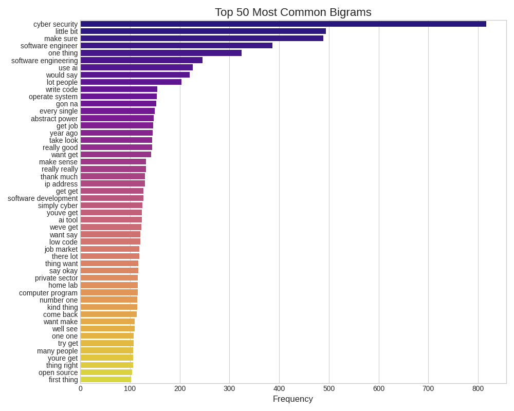
As part of the output, three images were/are generated. The first visualization is a bar graph displaying the most common 50 bigrams.

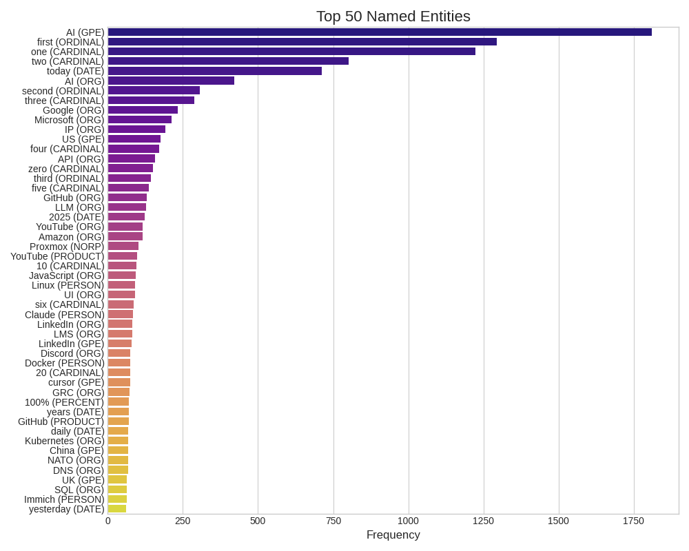
And the second image is a similar bar graph, but of the top 50 named entities most commonly referred to throughout all of the text.

In addition to the visualizations, my program produces a significant text-based analysis/report, featuring real-world metrics. Ultimately, all of this is done in an effort to understand the core message a body of text has by using the Python programming language.

Let’s programmatically turn 6MB of data into a 9.7 KB summary.

Along these lines, below you can find the .txt file my Python program produced after crunching 1.2 million words taken from YouTube video transcripts:

transcripts_enhanced_analysis_report.txt (9.7 KB)

Moving forward a little further. I submitted the Python analysis (the .txt file) to Anthropic. Which returned to me a breakdown of my prompt’s significance. Or, what hundreds of measurements mean, from an AI’s perspective.

I then took all three of these assets, the (1) original 6MB transcripts file, (2) Python analysis and (3) Anthropic summary, and fed them to ChatGPT. After following through with this chain of communication, I asked ChatGPT the following question, “What paradigm shifting changes or realizations can come from these notes?

Here are the six (IMO) quintessential points/observations printed onto my screen tonight:

  1. The generalist is dead. Contextual specialization is the new entry point.
  2. Certifications aren’t proof, they’re permission to get noticed.
  3. AI isn’t a tool you use, it’s a collaborator you must supervise.
  4. Security is not a department, it’s a design principle.
  5. Remote-first is not just location; it’s visibility, autonomy, and proof of impact.
  6. The biggest risk isn’t AI replacing you, it’s not learning to work alongside it.

These points match up closely with my own observations and recent experiences in the world(s) of technology and job seeking. And in some surprisingly accurate and poignant/sharp ways.

The reason why I am posting this walkthrough here is because (I think) it demonstrates how (1) old-fashion data crunching using Python, (2) a little gumshoe work for sourcing the YouTube transcripts and (3) two AI tools can produce near-intimate levels of relevance with their outputs. Without knowing much about who I am. Making the self-quantification happening here both personal and social.

I hope this kind of odd software project is of interest to you.

2 Likes

I’ve enjoyed following along on this project - extremely. I hope you continue to post about it. I read every post and often think about what you are doing and how I can learn from it.

In general, I’ve noticed that the troubleshooting help I get from Claude and ChatGPT has definitely gotten me across the activation barrier that had previously made it unlikely I would liberate myself from apps that control my data. Of course, I did a lot of exporting and data cleaning, but each time I did it, it was a highly specific and often painful workflow that couldn’t even be repeated a few days later because, if I had documented it, it would’ve doubled the work. Now I am slowly building a suite of general tools that work on text files so that I can have this kind of loosely amalgamated mass of material at the “bottom” of my workflows. You are doing something much more integrated and complex, but I still enjoy watching it.

1 Like

Thank you for your kind words about this thread and my various software projects. I will certainly continue posting about my quantified-self journey moving forward.

I can relate to your comment about receiving troubleshooting help from Claude and ChatGPT. Those technologies are important bridges for learning new skills quickly and interactively. Which means there is a lot of opportunity to upskill in relevant ways right now.

I would like to move on to another firsthand self-quantification experiment using custom-built hardware. This time I am going to be measuring my thermal body heat when sleeping over a period of a month or so.

From this experiment I may be able to answer the following questions:

  1. What are my normal sleeping hours?
  2. How often do I toss and turn?
  3. How often do I get up?
  4. What kinds of positions do I put my body in while sleeping?

To accomplish this task, I will be using the Adafruit AMG8833 IR Thermal Camera. Which will be connected to my Raspberry Pi 2 W computer, sending sixty four measurements every 3-5 seconds. The data will be stored in a CSV file for later use and analysis.

I am looking forward to visualizing this information, especially from over a significant period of time. I can see some pretty interesting graphs/maps coming out of this little experiment. As well as some new personal understandings.

I would like to add a little commentary with this post:

Tapping into my biorhythms for relevant, interesting and real data has been a wonderful experience. Which has enabled me to see how (1) commonly we already do it and (2) powerful of a habit it truly is.

One uses whatever they have in order to move into higher understandings about the world and themselves. I view these experiments as being as valuable and revealing as meditation or dieting or exercising. So long as the data can be used for personal transformation, using computers to collect it is alright with me.

Real progress has been made with regards to my ongoing self-quantification experiment. As I recently acquired the Adafruit AMG8833 IR Thermal Camera, which can be seen in the photo below:

The next step is to wait for additional hardware to show up, then it’s off to the races we go!

As mentioned in a previous post regarding this quantified-self project, I will be measuring my sleep positions over a prolonged period of time. Perhaps 30 to 60+ days?

The goal is to learn more about myself, as well as how to collect and visualize measurements with more than one value in an array. In this case, each measurement produced by the AMG8833 will have 64 values; one for each sector of the (8x8) lens.

I still have a bit of learning to do surrounding the Python and D3.js visualizations to be used. But things are coming together nicely overall. And, of course, there will be a Hackaday project page made for this tinkering, if that is something you’re interested in viewing. More to come soon.

1 Like

I’ve decided to take my interest in hardware, Python coding and self-quantification to another level. This evening I purchased 4 environmental sensors from Adafruit. These little tools (along with a RPi Zero 2 WH) will measure numerous variables simultaneously in my home over the course of a few weeks. With the data being stored as JSON.

Here is a screenshot of the items purchased for this experiment:

But this is only the first step.

Once I have confirmed the sensors are working and returning usable information, the next phase is to invest in a dedicated (more powerful) RPi computer. This device will power both the measurements and a frontend browser UI for displaying those values/metrics in real-time.

The purpose of this additional project is to create a sort of “vibes monitor” using feedback loops, environmental conditions and computers. Ultimately I would like to see if I can accurately detect and usefully visualize the “vibe of a space”. As well as use mindfulness to influence those measurements. By lowering or raising my body temperature, for example.

This effort is in its early stages, but I am optimistic moments of human experiences are quantifiable (and can be made interactive) with common technologies. Such as these Adafruit sensors and Raspberry Pi computers.

1 Like